
Axel Naumann on
Hi,
We have released a development release about a week ago. Probably not many people noticed - but it contains a revolution, and we'd like to know what you think about it: is it too brutal? Is it what you were longing for all your life?
The revolution I was referring to is not pink, orange, jasmine (is that a color?) or green: it's white and clean. It's ROOT's new default style and a modernization of the GUI look.
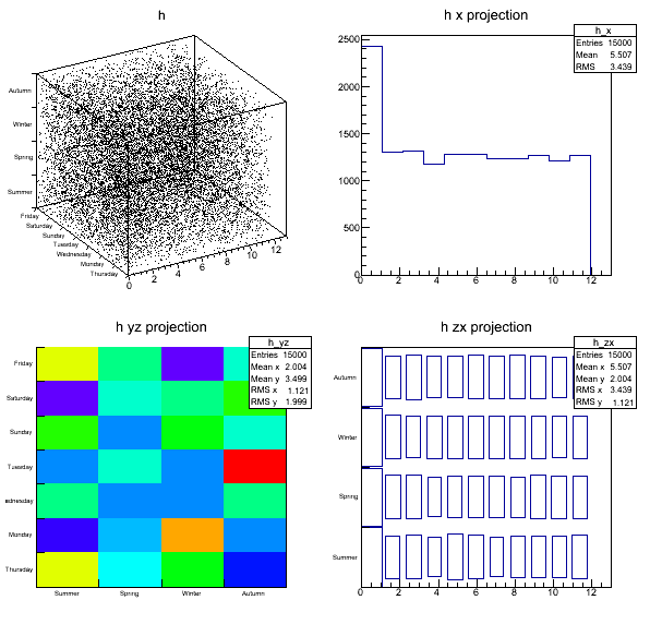
See the release notes or this excerpt on how to avoid it - and please post your comments about how you think we can improve it! Olivier and Bertrand will definitely still tweak a few things over the next weeks - but if we don't get feedback then this is what you'll have for the next ROOT decade ;-)
Cheers
Comments
Submitted by Anonymous (not verified) on Thu, 07/23/2015 - 21:28 Permalink
This is looks much better now
This is looks much better now and will impress new users even more. I've been using something similar for a long time.
Submitted by Anonymous (not verified) on Thu, 07/23/2015 - 21:29 Permalink
Re:Better
Hi lflexion,
Thanks for your feedback - glad you like it!
Cheers, Axel
Submitted by Anonymous (not verified) on Thu, 07/23/2015 - 21:29 Permalink
screenshots
Now you should re upload some of the screenshots :)
Submitted by Anonymous (not verified) on Thu, 07/23/2015 - 21:29 Permalink
Re: Screenshots
Hi Ozgur,
Yes, good point, I agree! I'll talk to Olivier and Bertrand - though I know they are very busy with converting the users guide to docbook (!) and the new GUI. So it might take a bit. But it will happen :-)
Cheers, Axel.
Submitted by Anonymous (not verified) on Thu, 07/23/2015 - 21:30 Permalink
converting the users guide to
finally User Guide in "normal" format ...
this is news ! maybe more info (new Recent Blog Posts). Anyway, thanks for great news.
Cheers, Jan
Submitted by Anonymous (not verified) on Thu, 07/23/2015 - 21:30 Permalink
Users Guide
Hi Jan,
Thanks for your comment! That's a good point: I will post what Olivier did with the Users Guide. It's still in the works - so wait a few days, please!
Cheers, Axel
Submitted by Anonymous (not verified) on Thu, 07/23/2015 - 21:30 Permalink
Good news :) I hope the next
Good news :) I hope the next step for the default style will be not to have the color bar with "colz" option which may overlap the last number of the X axis. I saw so many figs with the former ugly default style from seniors scientists ^^
Submitted by Anonymous (not verified) on Thu, 07/23/2015 - 21:30 Permalink
This depends on the axis
This depends on the axis labels. But I agree we can improve the default. You have long labels ? May be post an example on the forum showing what you mean.
Submitted by Anonymous (not verified) on Thu, 07/23/2015 - 21:31 Permalink
I can't belive this!
I can't belive this!
Submitted by Anonymous (not verified) on Thu, 07/23/2015 - 21:31 Permalink
Real
Hi Ruggero,
Yes, things happen. I interpret your comment as a positive one :-)
Cheers, Axel
Submitted by Anonymous (not verified) on Thu, 07/23/2015 - 21:31 Permalink
I think this looks much
I think this looks much better!
Submitted by Anonymous (not verified) on Thu, 07/23/2015 - 21:31 Permalink
Hi Whitney,
Hi Whitney,
Thanks for casting your vote!
Cheers, Axel.
Submitted by Anonymous (not verified) on Thu, 07/23/2015 - 21:31 Permalink
Much better now, this will
Much better now, this will impress new users even more. I have been using something similar for a long time.
Submitted by Anonymous (not verified) on Thu, 07/23/2015 - 21:31 Permalink
Thanks!
Hi Marcelo,
Thanks! For me it's not so much about impressing people but about providing defaults that reduce the amount of user intervention, i.e. that is "good enough" with respect to beauty and functionality. I think Olivier managed to find that configuration.
Cheers, Axel
Submitted by Anonymous (not verified) on Thu, 07/23/2015 - 21:32 Permalink
new style is bad
I don't like this new style. The result is more or less OK when drawing a simple image in a canvas, but the picture becomes unreadable when using multiple pads. In this case the fonts are hardly visible, there is no separation between pads and the titles are at a wrong position. mad
Submitted by Anonymous (not verified) on Thu, 07/23/2015 - 21:32 Permalink
Bad
Hi mad,
Thanks for your comment! The example I posted uses multiple pads, and while readability of the fonts is indeed an issue I don't see the other problems you mentioned. Could you post a screenshot on the forum?
Cheers, Axel.
Submitted by Anonymous (not verified) on Thu, 07/23/2015 - 21:32 Permalink
Finally!
Finally!
Submitted by Anonymous (not verified) on Thu, 07/23/2015 - 21:32 Permalink
I agree, the white background
I agree, the white background is a much, much better default. I also like the new default for col. The default blue for 1D histograms while however soon be draining my blue printer cartridge I fear.
Submitted by Anonymous (not verified) on Thu, 07/23/2015 - 21:32 Permalink
It's... It's beautiful!
I've been waiting for this for a long, long time... It'll greatly reduce the number of lines in my .rootlogon.C :)
Submitted by Anonymous (not verified) on Thu, 07/23/2015 - 21:32 Permalink
This is great! No more need
This is great! No more need to set SetStyle("Plain"). And no more ugly grey plots from new students :-)
Submitted by Anonymous (not verified) on Thu, 07/23/2015 - 21:33 Permalink
Credits
Hi Robert
Thanks for your comment! That's right, it's in my opinion even better than the plain style. It's based on a combination of the experiments' official styles, tweaked e.g. for backward compatibility.
Cheers, Axel
Submitted by Anonymous (not verified) on Thu, 07/23/2015 - 21:33 Permalink
Hooray! But now how will we
Hooray! But now how will we tell when a plot was made by an undergrad summer student? :)