
Table of Contents
- Rainbow Color
- Color maps in High Energy Physics
- From a rainbow color map plot to a more meaningful one
- Another Example
The aim of this page is to explain why the rainbow color map is not the best one can choose to represent physics data in pseudo color and to propose better solutions. It was written by Bernice Rogowitz (Visual Perspectives) and Olivier Couet (CERN).
To introduce this topic, we will describe the work we did on the candidate Higgs boson data. In this experiment, two specially-constructed beams of particles were set to collide in front of a particle detector, tuned to measure the energy emitted by the decay of the hypothesized Higgs Boson. Hundreds of trillions of collisions were analyzed to extract the signature of the Higgs Boson, which was predicted to have a mass between 125 and 127 GeV/C2 (Giga Electron Volts). The data represented in the four panels below is the distribution of electron volts across the particle sensor.
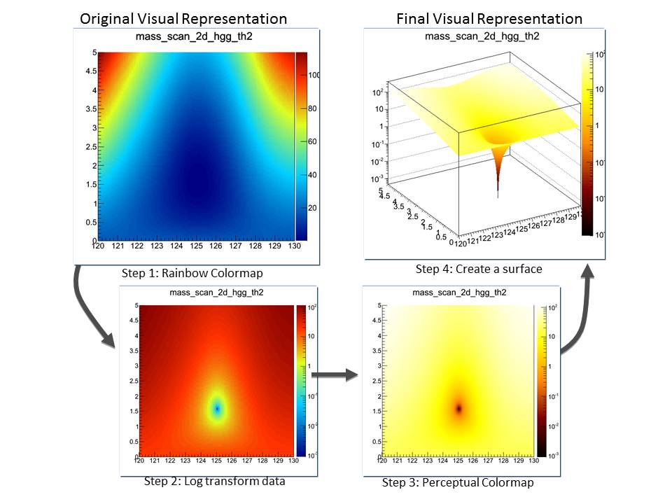
Figure 1 This figure shows four different representations of the candidate Higgs-Boson data. The top left shows a rainbow colormap applied to the voltage data. In the bottom left, the analyst introduced a logarithmic transform to the data, to better reveal variations at the low end of the range. In the bottom right, the rainbow colormap was replaced with a “perceptual” colormap, so that equal magnitude changes in the data would look like equal steps, perceptually. Finally, in the top right, the voltage values were also represented as a 3-D surface, so that the rapid variations at the low-end of the range could be better appreciated.
Rainbow Color
Definition
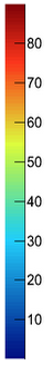
| The rainbow color map is named that way because it goes through all the rainbow's colors. The lower values are in the beep blue range and the higher values in the reds. In between it passes trough light blue green, yellow, orange ... It is used as a default in many visualization systems since it is easy to calculate (it is a linear interpolation between (0,0,255) and (255,0,0) in RGB color space), and because the bright colors are visually appealing. |
 |
Problems
As it is explain in several visualisation articles the rainbow color map can be misleading when visualising data. The main issues with this kind of color map are:
- It is confusing because it doesn't have a monotonic perceptual ordering,
- structures in the data can be hidden, since not all data variations are represented visually,
- the fact the luminance is not controlled can hide data,
- it introduces gradients not related to the data,
- it artificially divides the data into a small number of categories, one for each color.
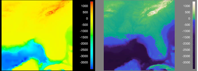
Figure 2 These two panels show the same data, but with different colormaps. On the left, the "Rainbow" colormap provides a very colorful and vibrant image, however, it masks significant features in the data, and emphasizes less important ones. The "Perceptual" colormap in the right panel explicitly identifies the "0" in the data, which is sea level, and provides monotonic luminance variations above and below zero. This colormap provides a more faithful representation of the structures in the data.
Color maps in High Energy Physics
The rainbow is used a lot in High Energy Physics. Still it is the default color map in system like ROOT. On 2012, July 4th physics results showing the evidence of a new boson compatible with the Higgs boson signature were presented by the LHC experiments. Several plots using rainbow color maps were shown. On all of them the results were very clear, and were cross-checked by all kinds of other representations like bar charts or contour plots. Nevertheless we will see in this page how better color maps could have been used.How the rainbow color map can mask structure in the data
| With this color map, structures within the [0.1, 0.2] and [0.3, 0.6] ranges are invisible. The rule should be that equal steps in data value should correspond to equal perceptual steps. The rainbow color map does not preserve intervals in data. The data are "interval"; the representation is "ordinal". | 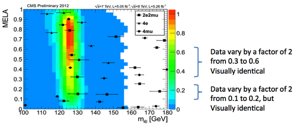 |
From a rainbow color map plot to a more meaningful one
The data used for this exercise are from the CMS experiment. They show the boson mass at 125 GeV. The basic macro used to produce the plots is the following. It simply attached the data file mass_scan_maps_th2.root, define a palette and draw the histogram mass_scan_2d_hzz_th2 using this palette.This histogram has more bins than the previous example, playing on them with various colormap will be more interesting.{ TFile f("mass_scan_maps_th2.root"); mass_scan_2d_hzz_th2->SetContour(100); // Define color map gStyle->SetPalette(55); // Draw the histogram as a color plot mass_scan_2d_hzz_th2->Draw("colz"); }
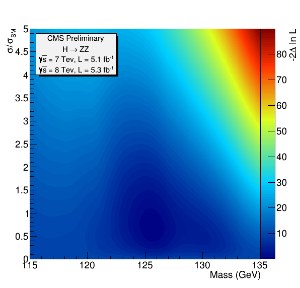
Rainbow color map in linear scale
| The rainbow color map on the "Higgs data" gives the next output. They data look pretty continuous, so we probably won't find any surprising structures, but we might get more visual insight into the shape of the continuous variation.
The gradians artefacts in are clearly visible. in the light blue, yellow and red part of the map |
 |
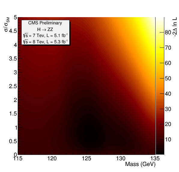
Dark Body Radiator color map in linear scale
This color map does not have the problems we saw on the previous plot. To obtain it is ROOT it is enough to do:
gStyle->SetPalette(53);The plot still looks continuous, but we do not have the gradians artefacts we saw with the rainbow color map. We should now try to make more evident the data structure in the continuous areas in the lower part of the color map. |
 |
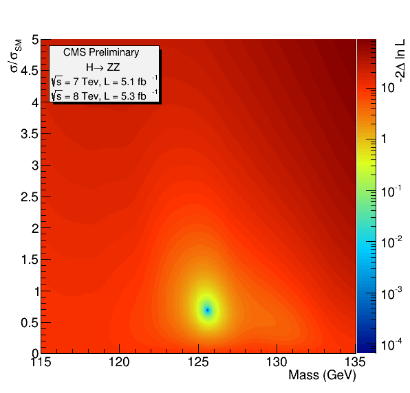
Rainbow color map in logarithmic scale
| To make more visible the structure in the lower part of the color map, we go into logarithmic scale along the Z axis.
This works very well and we can clearly see the spot at 125 GeV. But as we are back to the rainbow color map the artefact reappear. And we can see "rings" (in particular in the yellow range) which do not have any significance regarding the data set. |
 |
Dark Body Radiator color map in logarithmic scale
| Going back to the Dark Body Radiator the "rings" disappear and we a back to a continuous gradation of tones, and, thanks to the logarithmic scale, the spot at 125 GeV is still clearly visible. | 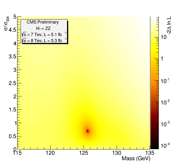 |
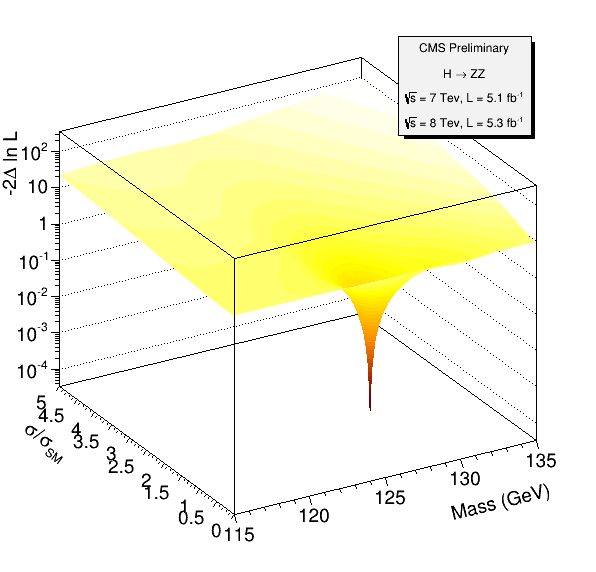
Surface plot with a Dark Body Radiator color map in logarithmic scale
Finally going to a 3D surface makes the spot even more obvious ! The root command to obtain this surface is:
mass_scan_2d_hzz_th2->Draw("surf2");
|
 |
Another Example
This case demonstrate the use of different colormaps for low- and high- spatial frequency data set.The image below shows four surfaces expressing the ozone level over the south pole. The rainbow colormap (left top) is compared with a luminance map (top right), which is great for showing high spatial frequency detail. The bottom left shows a saturation map, where red and green increase in saturation from yellow at the midpoint of the data. This is great for displaying low spatial-frequency variations. The bottom right shows both a luminance ramp and a saturation scale, together, which reveals both low- and high-spatial frequency information.
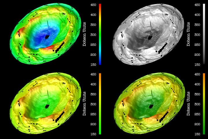
Figure 3 Four different colormaps are explored in this figure showing ozone levels in the southern hemisphere. The top-left panel shows the rainbow colormap. The top-right panel demonstrates how well a luminance-based colormap represents high-spatial-frequency (detailed) information. The bottom-left panel demonstrates how well a saturation-based colormap reveals low-spatial-frequency information. Combining luminance and saturation produces colormap that communicates both low and high-spatial frequency information, and may be a good candidate for a new default colormap. Source: Rogowitz, B.E. and Treinish, L.A., "Data Visualization: The End of the Rainbow" IEEE Spectrum 35, Issue 12, pp. 52-59, 1998.