WARNING: This documentation is not maintained anymore. Some part might be obsolete or wrong, some part might be missing but still some valuable information can be found there. Instead please refer to the ROOT Reference Guide and the ROOT Manual. If you think some information should be imported in the ROOT Reference Guide or in the ROOT Manual, please post your request to the ROOT Forum or via a Github Issue.
% Chapter: Writing G U I ________________________________________________________________________________________ WARNING: This documentation is not maintained anymore. Some part might be obsolete or wrong, some part might be missing but still some valuable information can be found there. Instead please refer to the ROOT Reference Guide and the ROOT Manual. If you think some information should be imported in the ROOT Reference Guide or in the ROOT Manual, please post your request to the ROOT Forum or via a Github Issue.
% Chapter: Writing G U I ________________________________________________________________________________________ WARNING: This documentation is not maintained anymore. Some part might be obsolete or wrong, some part might be missing but still some valuable information can be found there. Instead please refer to the ROOT Reference Guide and the ROOT Manual. If you think some information should be imported in the ROOT Reference Guide or in the ROOT Manual, please post your request to the ROOT Forum or via a Github Issue.
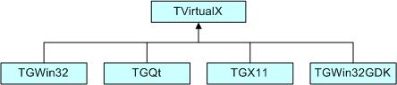
The ROOT GUI classes support an extensive and rich set of widgets with the Windows 95 look and feel. The widget classes interface to the underlying graphics system via a single abstract class. Concrete versions of this abstract class have been implemented for X11 and Win32, thereby making the ROOT GUI fully cross-platform. Originally the GUI classes were based on Hector Peraza’s Xclass’95 widget library http://xclass.sourceforge.net/
Features of the GUI classes in a nutshell:
Originally based on the Xclass’95 widget library
A rich and complete set of widgets
Win’95 look and feel
All machine dependent graphics calls abstracted via the TVirtualX “abstract” class
Completely scriptable via the C++ interpreter (fast prototyping)
Supports signal/slot event handling as pioneered by Trolltech’s Qt
Full class documentation is generated automatically (as for all ROOT classes)
Code generation for variety of GUI’s
The ROOT GUI classes provide of set of components that allow an easy way to develop cross-platform GUI applications with a Windows look and feel.
The main widgets are:
Simple widgets: labels, icons, push buttons, either with text or pixmaps, check buttons, radio buttons, menu bars and popup menus, scroll bars, list boxes, combo boxes, group frames, text entry widgets, tab widgets, progress bars, sliders, tool tips
Complex widgets: shutter, toolbar, status bar, list view, list tree
Common dialogs: File Open/Save, File Properties, Font Selection, Color Selection, About
The widgets are shown in frames:
frame, composite frame, main frame, transient frame, group frame
Arranged by layout managers:
horizontal layout, vertical layout, row layout, list layout, tile layout, matrix layout
Using a combination of layout hints:
Event handling by signals/slots and messaging (as opposed to callbacks):
in response to actions widgets send messages and emit signals
associated frames process these messages or the slot methods connected to the signals are executed
The GUI classes interface to the platform dependent low level graphics system via the semi-abstract graphics base class TVirtualX. Currently concrete implementations exist for X11 and Win32 (MacOS X is fully supported via Apple’s X11 implementation). Thanks to this single graphics interface, porting the ROOT GUI to a new platform requires only the implementation of TVirtualX.
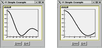
We will start with a simple example that builds a small application containing a canvas and two buttons: Draw and Exit. Its functionality will be very simple: every time you click on Draw button, the graphics of the function sin(x)/x will be drawn in randomly chosen interval in the canvas window, if you click on Exit - you close the application. This example shows the basic concepts for almost any GUI-application in ROOT and it is important to understand how it is constructed. The example program is written as a named script. See “Cling the C++ Interpreter”. Remember that the named script can be executed via
only if the filename (without extension) and the function entry point are both the same.
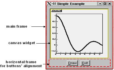
We need to say a few words about the parent-children relationship between the widgets before going through the real code. The widgets’ behaviors are based on this relationship. Every parent widget is responsible for where the children are and it ensures all properties and behavior for them. For example, if you want to hide several widgets, it will be enough to hide their parent widget. Later you can show the parent and the children will appear too. Writing your code you have to specify the parent-child relationship. Usually in a child constructor the address of the parent is passed as an argument. In general frames are parents of simple widgets. In this example you will see how we organize the parent-children relationship by using frame widgets in addition to the canvas window and button widgets.
Let’s now go through the code of the example.C.
The first lines include ROOT header files. The header file names are almost always as the class names (TApplication, TF1, TCanvas), but there are cases when similar classes are grouped together in one header file: all frames are declared in TGFrame.h, all buttons - in TGButton.h, etc. Our small example is based on an object of the class MyMainFrame.
The first parameter gClient->GetRoot() makes the initial connection to the window server. It is a pointer to the root window of the screen, which is obtained from gClient. The next two parameters initialize the width and height of the application window in pixels. Let see what MyMainFrame is. The three arguments pass to the TGMainFrame constructor when we create the fMain object.
The first thing to note is the inclusion of the RQ_OBJECT macro in the class declaration of MyMainFrame. It is necessary to provide a standalone class signal/slot capability. The signal/slot communication mechanism is described in a separate chapter. See “Event Processing: Signals and Slots”.
// example.C

#include <TGClient.h>
#include <TCanvas.h>
#include <TF1.h>
#include <TRandom.h>
#include <TGButton.h>
#include <TGFrame.h>
#include <TRootEmbeddedCanvas.h>
#include <RQ_OBJECT.h>

class MyMainFrame {
   RQ_OBJECT("MyMainFrame")
private:
   TGMainFrame         *fMain;
   TRootEmbeddedCanvas *fEcanvas;
public:
   MyMainFrame(const TGWindow *p,UInt_t w,UInt_t h);
   virtual ~MyMainFrame();
   void DoDraw();
};
MyMainFrame::MyMainFrame(const TGWindow *p,UInt_t w,UInt_t h) {
   // Create a main frame
   fMain = new TGMainFrame(p,w,h);

   // Create canvas widget
   fEcanvas = new TRootEmbeddedCanvas("Ecanvas",fMain,200,200);
   fMain->AddFrame(fEcanvas, new TGLayoutHints(kLHintsExpandX |
                   kLHintsExpandY, 10,10,10,1));
   // Create a horizontal frame widget with buttons
   TGHorizontalFrame *hframe = new TGHorizontalFrame(fMain,200,40);
   TGTextButton *draw = new TGTextButton(hframe,"&Draw");
   draw->Connect("Clicked()","MyMainFrame",this,"DoDraw()");
   hframe->AddFrame(draw, new TGLayoutHints(kLHintsCenterX,
                                            5,5,3,4));
   TGTextButton *exit = new TGTextButton(hframe,"&Exit",
                                "gApplication->Terminate(0)");
   hframe->AddFrame(exit, new TGLayoutHints(kLHintsCenterX,
                                            5,5,3,4));
   fMain->AddFrame(hframe, new TGLayoutHints(kLHintsCenterX,
                                             2,2,2,2));

   // Set a name to the main frame
   fMain->SetWindowName("Simple Example");

   // Map all subwindows of main frame
   fMain->MapSubwindows();

   // Initialize the layout algorithm
   fMain->Resize(fMain->GetDefaultSize());

   // Map main frame
   fMain->MapWindow();
}
void MyMainFrame::DoDraw() {
   // Draws function graphics in randomly chosen interval
   TF1 *f1 = new TF1("f1","sin(x)/x",0,gRandom->Rndm()*10);
   f1->SetLineWidth(3);
   f1->Draw();
   TCanvas *fCanvas = fEcanvas->GetCanvas();
   fCanvas->cd();
   fCanvas->Update();
}
MyMainFrame::~MyMainFrame() {
   // Clean up used widgets: frames, buttons, layout hints
   fMain->Cleanup();
   delete fMain;
}
void example() {
   // Popup the GUI...
   new MyMainFrame(gClient->GetRoot(),200,200);
}
The TGMainFrameclass defines a top level window that interacts with the system window manager. Its method CloseWindow() is invoked when Alt+F4 are pressed or a window manager close/exit command is used. To terminate the application when this happens you need to override the CloseWindow() method and call gApplication->Terminate(0).
The main frame can be considered as a container where all widgets of the application are organized with respect to their parent-child relationship. After the main frame we create fEcanvas - an object of class TRootEmbeddedCanvas. It is a quite complex widget and we will explain it in detail later. For the moment keep in mind only its main purpose - to create a TCanvas - the ROOT basic whiteboard for drawing and editing different graphical objects.
In the TRootEmbeddedCanvas constructor we pass the address of the main frame widget fMain as a second parameter. This pass is important because it makes fMain the parent of the canvas window. The first parameter Ecanvas is the name of the TCanvas, the last two parameters give the width and height of canvas window in pixels. Next step is to add fEcanvas to the parent frame defining its appearance inside the parent window. We use the method AddFrame():
It adds the fEcanvas into the list of children widgets of the main frame fMain. The specification of how it should be placed inside the parent frame is made by the TGLayoutHints object. Setting its first parameter to kLHintsExpandX|kLHintsExpandYwe define the canvas window as expanded on x and y in the frame. The next four parameters define amounts of padding in left, right, top and bottom in pixels. This means that the canvas window will be expanded when the parent window expands, but it will keep around a frame of 10 pixels on left, right, top and 1 pixel on bottom.
The laying out is always made with respect to the parent-children relationship. There is a special chapter presenting the different layout managers, but we will quickly introduce the concept here. The layout process will apply not to the embedded canvas window but to its parent - the main frame. A popular layout manager and the one used in this case is the vertical layout manager which arranges its widgets vertically in a column.
The next widget we create as a child of the main frame is the horizontal frame hframe:
The first parameter of its constructor is again the address of its parent, fMain. The next ones define the frame width and height in pixels. The name of the class TGHorizontalFrame gives a hint that a horizontal layout will apply on its children widgets. The Draw and Exit buttons will be laid out horizontally. Here are their constructors:
TGTextButton *draw = new TGTextButton(hframe,"&Draw");
hframe ->AddFrame(draw, new TGLayoutHints(kLHintsCenterX,5,5,3,4));
TGTextButton *exit = new TGTextButton(hframe,"&Exit",
                                     "gApplication->Terminate(0)");
hframe ->AddFrame(exit,new TGLayoutHints(kLHintsCenterX,5,5,3,4));
They are created as objects of the TGTextButton class that represent the command buttons with a text label. When you click on a command button it performs the action shown on its label. These buttons are well known as “push buttons” or just “buttons”. The parent address hframe is passed as first parameter. The second one defines the button label and normally indicates the action to be taken when the button is clicked. It is possible to define a hot key for the button at that point using the hot string for its label. A hot string is a string with a “hot” character underlined. This character we call the button hot key. It shows the assigned keyboard mnemonic for the button choice. Following our example, this means that you can use Alt+D to click on Draw button and Alt+E to click on Exit. There is a possibility to specify a command string as third parameter of the button constructor. We use it to assign the command gApplication->Terminate(0). The application will be terminated when you click on the Exit button.
We call again AddFrame() to add the buttons to their parent widget giving layout hints for each of them. This time we would like to have centered buttons with an amount of 5 pixels on the left, 5 on the right, 3 on the top and 4 on the bottom. You can feel already that the same steps are repeated three times: to create a new widget with passing a parent address as a parameter, to define layout hints for it and to add it in the parent list. The next line is something new:
Here we connect a signal to a slot. Whenever the draw button is clicked, it emits a signal that something has happened (it is clicked) to whom might be interesting in the outside world. The widget does not know who will use this information. On the other side of the program world there is some code which should be executed when the button is clicked. This code is called a slot. Think about slots as normal C++ functions or class methods. The line above specifies that the slot MyMainFrame::DoDraw() will be executed when the draw button is clicked. Our slot draws the graphics of sin(x)/x in randomly chosen interval every time the draw button sends a signal “I am clicked”. The signal/slot communication mechanism originally featured in Qt by TrollTech(see http://doc.trolltech.com/3.1/signalsandslots.html). ROOT supports its own version of signals/slots. We will return to that point in details later. We specified all child widgets of the horizontal frame (the Draw and Exit buttons in our case). Next, we need to add their parent frame to the main frame:
The last thing to do is to set the main window title and to make all widgets visible. Commonly in all systems windows are assigned by name to be identified by users. This name is displayed in the application’s title bar and can be set by:
The next lines make the widgets visible. The first one maps all child frames of the top-level frame; the last one - the main frame itself, i.e. makes it appear on the screen.
The line in between has an important mission - to execute all layout specifications for the widgets before the top-level window itself is shown on the screen. We can run the named script via the Cling interpreter with the command:
The event processing starts. If you change the state of a widget, it emits a signal and the corresponding slot is executed ensuring the functionality we want for this small example.
The steps we passed can be generalized as follows:
Opening of the connection to the system
Definition of main frame (top level window)
Creation of widgets as children of the top-level frame; assign them desired properties following the steps:
Create a new widget passing its parent in the constructor
Connect widget’s signals with desired slots to ensure desired functionality
Define widget’s layout and add it to the parent list of children
Set main window attributes
Map all sub windows
Initialize the layout algorithm via Resize(GetDefaultSize()) method
Map the main frame
Execution of the even-processing loop
As usual a standalone program in C++ has to contain a main() function - the starting point for the application execution. In this case it is better to separate the program code creating a program header file example2a.h with the MyMainFrame class declaration and example2a.cxx- with the class methods implementation. To run our simple example as a standalone application we need to create in addition an object of class TApplication. It will make a correct initialization of the dictionaries if it is not yet done. It will be responsible for holding everything together and to handle all events in the application. Its environment provides an interface to the ROOT graphics system and by calling the Run() method the event loop starts and the application program is waiting for the user action. The application exits only if the top level window is not closed. Two header files are used in addition: TApplication.h - for the class TApplication and TGClient.h that is used to make initial connection to the graphics system. The class TApplication must be instantiated only once in any given application. The original list of argument options can be retrieved via the Argc() and Argv() methods.
Note: to have signals/slots working we need to create a dictionary for the class MyMainFrame, i.e. we create the file ex2aLinkDef.h containing the line:
We compile the example:
rootcling -f ex2aDict.cxx -c example2a.h ex2aLinkDef.h
g++ -o example2a example2a.cxx ex2aDict.cxx `root-config --cflags --glibs`
example2a.h
#include <TQObject.h>
#include <RQ_OBJECT.h>

class TGWindow;
class TGMainFrame;
class TRootEmbeddedCanvas;

class MyMainFrame {
   RQ_OBJECT("MyMainFrame")
private:
   TGMainFrame         *fMain;
   TRootEmbeddedCanvas *fEcanvas;
public:
   MyMainFrame(const TGWindow *p,UInt_t w,UInt_t h);
   virtual ~MyMainFrame();
   void DoDraw();
};
example2a.cxx
#include <TApplication.h>
#include <TGClient.h>
#include <TCanvas.h>
#include <TF1.h>
#include <TRandom.h>
#include <TGButton.h>
#include <TRootEmbeddedCanvas.h>
#include "example2a.h"

MyMainFrame::MyMainFrame(const TGWindow *p,UInt_t w,UInt_t h) {...}
MyMainFrame::~MyMainFrame() { ... }
void MyMainFrame::DoDraw() { ... }
void example() { ... }

int main(int argc, char **argv) {
   TApplication theApp("App",&argc,argv);
   example();
   theApp.Run();
   return 0;
}
The class MyMainFrame could derive from TGMainFrame. In that case the RQ_OBJECT macro is not needed anymore, since the functionality it provides is obtained now via inheritance from TGMainFrame. This will reflect in the MyMainFrame class declaration and in the code of the MyMainFrame::MyMainFrame constructor as follows:
example2b.h
#include <TGFrame.h>
class MyMainFrame : public TGMainFrame {
private:
   TRootEmbeddedCanvas *fEcanvas;
public:
   MyMainFrame(const TGWindow *p,UInt_t w,UInt_t h);
   virtual ~MyMainFrame() {  ...  }
   void DoDraw(){  ...  }
   ClassDef(MyMainFrame,0)
};
example2b.cxx
#include <TApplication.h>
#include <TGClient.h>
#include <TCanvas.h>
#include <TF1.h>
#include <TRandom.h>
#include <TGButton.h>
#include <TRootEmbeddedCanvas.h>
#include "example2b.h"

MyMainFrame::MyMainFrame(const TGWindow *p,UInt_t w,UInt_t h)
   : TGMainFrame(p,w,h) {

   // Creates widgets of the example
   fEcanvas = new TRootEmbeddedCanvas ("Ecanvas",this,200,200);
   AddFrame(fEcanvas, new TGLayoutHints(kLHintsExpandX |
                                    kLHintsExpandY, 10,10,10,1));
   TGHorizontalFrame *hframe=new TGHorizontalFrame(this, 200,40);
   TGTextButton *draw = new TGTextButton(hframe,"&Draw");
   draw->Connect("Clicked()","MyMainFrame",this,"DoDraw()");
   hframe->AddFrame(draw, new TGLayoutHints(kLHintsCenterX,
                                            5,5,3,4));
   TGTextButton *exit = new TGTextButton(hframe,"&Exit ",
                                "gApplication->Terminate()");
   hframe->AddFrame(exit, new TGLayoutHints(kLHintsCenterX,
                                            5,5,3,4));
   AddFrame(hframe,new TGLayoutHints(kLHintsCenterX,2,2,2,2));

   // Sets window name and shows the main frame
   SetWindowName("Simple Example");
   MapSubwindows();
   Resize(GetDefaultSize());
   MapWindow();
}The word widget is a contraction of windows and gadget. Almost all GUI elements are widgets. A button is a widget, a menu item is a widget, a scrollbar is a widget, and a complete dialog box is a widget too. Some widgets may have sub widgets. For example, a dialog box can contain buttons, text fields, a combo-box, etc.
On the screen widgets look like rectangular areas with special behaviors. In terms of the object-oriented programming we can define a widget in ROOT as an object of a class deriving from TGObject.
This section presents all currently supported widgets in ROOT and their most useful methods. All of them can be considered as building blocks for an application, and most of them can be found in dialogs. Provided snippets of the code will give you practical guidelines where and how to use certain widgets. The macro $ROOTSYS/tutorials/visualisation/gui/guitest.C contains the complete source code.
Any custom widget can be created by sub classing existing widgets. To achieve a better understanding of the widgets’ properties they are separated by their type and their inheritance. As all of them inherit from TGObject and most from TGWidget, these base classes are described first.
TGObject is the base class for all ROOT GUI classes. It inherits from TObject. The two data members of this class contain important information about X11/Win32 window identifier and the connection to the host’s graphics system. Every GUI element, which derives from TGObject has access to the TGClient via the data member fClient of TGObject. TGClient creates the connection with the host’s graphics system and sets up the complete graphics system for all widgets.
The widgets base class TGWidget is typically used as a mix-in class via multiple inheritances. Its properties are available for all deriving widgets: TGButton, TGComboBox, TGTab, TGColorPalette, TGColorPick, TGDoubleSlider, TGListTree, TGNumberEntry, TGScrollBar, TGShutterItem, TGTextEntry, TGSlider, TGListBox, TGView.
This class has four data members keeping information about the widget id - important for event processing, the window which handles the widget’s events, the widget status flags and the assigned command (if there is any). The general properties of TGWidget are specified by SetFlags(Int_t flags) and ClearFlags(Int_t flags) methods. The status flags are: kWidgetWantFocus, kWidgetHasFocus, and kWidgetIsEnabled. The method Associate(const TGWindow* w) - sets the window which handles the widget events. SetCommand(const char* command) - sets the command to be executed. The command string can be gathering via GetCommand() method. For example, the third parameter in TGTextButton constructor can be omitted and set later in your program, i.e. instead of:
You will have the following the two lines:
TGTextButton *exit = new TGTextButton(hframe,"&Exit");
exit->SetCommand("gApplication->Terminate()");
The method IsEnabled() - returns kTRUE if the widget has flag kWidgetIsEnabled and it accepts user events. This method is very important for creating a good user interface because it allows you to disable or enable a widget depending on the situation of your application. As a standard all disabled widgets are displayed “grayed out”. HasFocus() - returns kTRUE if the widget has the input focus (i.e. flag kWidgetHasFocus is set). Remember that only one item in a complex widget as a dialog can have the value of HasFocus() sets as true. WantFocus() - returns kTRUE if the flag kWidgetWantFocus is set.
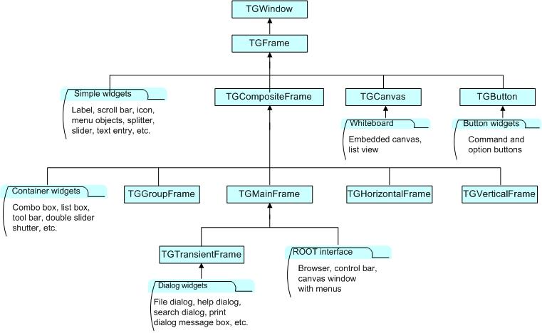
TGWindow is a ROOT GUI window base class. It inherits from TGObject and TGFrame derives from it. The application does not use it directly. It creates and registers a new window within the system. This window has common characteristics: existing parent, location, size in height and width (it has a default minimum size 1, 1 under which it cannot shrink), border with particular view, state, specific attributes. If there are no specified arguments their values will be taken from the parent. It receives events from the window system and can paint a representation of itself on the screen.

Most of the frame classes are mainly created for arranging widgets in a window. The class TGFrame is a subclass of TGWindow providing additional window characteristics and overriding some methods of TGWindow. It is a base class for the simple widgets as buttons, labels, etc. Its only purpose is to draw a frame around widgets that do not have a frame of their own. The main groups of TGFrame member functions are:
Window’s functions: DoRedraw(), DeleteWindow(), Activate(), etc.
Geometry functions: Move(), Resize(), SetSize(), etc.
Graphics handlers: ChangeBackground(), ChangeOptions(), etc.
Mouse and keyboard functions: HandleButton(), HandleFocusChange(), HandleKey(), HandleMotion(), etc.
Event handlers: HandleEvent(), ProcessEvent(), GetSender(), SendMessage(),ProcessMessage(), GetLastClick(), etc.
Ones of TGFrame member functions provide direct functionality; others - will be overridden by TGFrame subclasses to ensure particular widget’s functionality. There are two constructors provided in TGFrame class. One creates a frame using an externally created window:
For example, it can register the root window (called by TGClient), or a window created via TVirtualX::InitWindow() (window id is obtained by TVirtualX::GetWindowID() method). The other TGFrame constructor is:
TGFrame(const TGWindow *p,UInt_t w,UInt_t h,UInt_t options=0,
ULong_t back = GetDefaultBackground());
The options parameter is the bitwise OR between defined frame types. Here is a short description of these types:
| Frame Type | Description |
kChildFrame |
a frame embedded in a parent |
kMainFrame |
a main frame interacting with the system Window Manager |
kTransientFrame |
a top level dialog’s frame |
kVerticalFrame |
a frame that layouts its children in a column |
kHorizontalFrame |
a frame that layouts its children in a row |
kSunkenFrame |
a frame with a sunken board appearance |
kRaisedFrame |
a frame with a raised board appearance |
kFitWidth |
a frame with dynamically scaled width |
kFitHeight |
a frame with dynamically scaled height |
kFixedWidth |
a frame with fixed width |
kFixedHeight |
a frame with fixed height |
kFixedSize |
= a frame with fixed width and height |
kDoubleBorder |
a frame having a double line border |
kOwnBackground |
a frame having own background |
kTempFrame |
a temporary frame shown in certain circumstances; for example, it is used for creation of tool tip widget |
The method ChangeOpton(UInt_t options) allows you to change frame options. Next example shows you how to change kVerticalFrame option to kHorizontalFrame:
The class TGCompositeFrame is the base class of all composite widgets as a menu bar, a list box, a combo box, etc. It subclasses TGFrame and has in addition a layout manager and a list of child frames/widgets. There are two steps to do the design using a composite frame widget. First you put all widgets you need within this frame and assign them desired properties using AddFrame(), then you lay them out by the Layout() method according to the assigned layout manager. The method AddFrame() creates an instance of TGFrameElement class for every child widget of a composite frame. This class has three public data members: the child pointer, its layout hints, and a status variable showing if the child is visible or hidden. If no hints are specified, the default layout hints are used. Because the layout is very important part of any design we include a special section about layout management and layout hints.
You can set a layout manager for the composite frame via:
The child widgets cannot be added to different composite frames.
Any child frame can be removed from the parent list by:
You can hide or show a child frame of a composite frame using the methods: HideFrame(TGFrame *f) or ShowFrame(TGFrame *f). You should call, for example HideFrame(TGFrame *f), only after the frames have been laid out and the sub windows of the composite frame have been mapped via method MapSubwindows(), i.e.
frame->AddFrame(hFrame1,fLayout1);
frame->AddFrame(hFrame2,fLayout2);
frame->Resize(frame->GetDefaultSize()); // lays out frames
frame->MapSubwindows();                 // maps subwindows
frame->HideFrame(hFrame2);              // hides frame hFrame2
frame->MapWindow();                     // maps main frame
The state information about a child frame can be obtained from the methods GetState(TGframe *f), IsArranged(TGFrame *f), and IsVisible(TGFrame *f).
The method Cleanup() deletes all objects of the composite frame added via AddFrame(). All TGFrameElement objects (frames and layout hints) must be unique, i.e. cannot be shared.
We already mentioned that TGMainFrame class defines top level windows interacting with the system window manager. It handles applications with a menu bar, toolbar, text entry fields and other widgets surrounding a central area (e.g. a canvas widget). It lays out a set of related widgets and provides the typical application main window behavior. As you can see from the Figure above, it inherits from TGCompositeFrame and is inherited by TGTransientFrame and several ROOT interface classes: TViewerX3D,TRootBrowser, TRootCanvas, TRootControlBar, TTreeViewer.
To fix the size of a top level window you have to use the method TGMainFrame::SetWMSize(). This call tells the Window Manager that it should not resize the window. The option kFixedSize works only for embedded frames like TGCompositeFrame and derived classes (in combination with layout hints).
The TGVerticalFrame and TGHorizontalFrame are composite frames that lay out their child frames in vertical or horizontal way in the same order as they were added and according to their hints preferences.
The TGTransientFrame class defines transient windows that typically are used for dialogs. They extend and complete an interaction within a limited context. Always transient frames are displayed from another window or another dialog. They may appear because of a command button being activated or a menu item being selected. They may also present automatically when an additional input and the user attention are required by a certain condition.
The TGGroupFrame class presents a very convenient frame which surrounds visually a group of logically connected widgets: radio buttons, related check boxes, two or more functionally related controls.
It is a composite frame with a border and a title. The title explains the purpose of the group and should be a noun or noun phrase. Here is an example taken from guitest.C:
groupFrame = new TGGroupFrame(tf,"Options",kVerticalFrame);
groupFrame->SetTitlePos(TGGroupFrame::kLeft);
The second line sets the title position on the left. You can change it to be centered or right aligned if you use TGGroupFrame::kCenter or TGGroupFrame::kRight as a parameter.
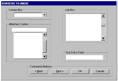
Be conservative in the use of borders because of the potential for clutter. Do not place them around single entry fields, single combo boxes, list boxes and groups of command buttons. The design of these widgets provides them with a border. The picture above provides kind of borders to avoid.
The layout process is an integral part of any GUI. When you create a simple message window, laying out its few buttons and text widgets is quite simple. However, this process becomes increasingly difficult if you have to implement large GUI’s with many widgets that should behave properly when the GUI is resized or uses a different font type or size. Layout management is the process of determining the size and position of every widget in a container.
A layout manager is an object that performs layout management for the widgets within a container. You already know that when adding a component (child widget) to a container (parent widget) you can provide alignment hints (or rely on the default ones). These hints are used by the layout manager to correctly position the widgets in the container. The TGLayoutManager is an abstract class providing the basic layout functionality.
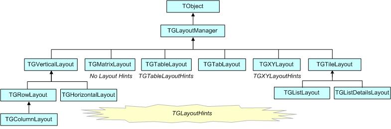
The base “container” class is TGCmpositeFrame. You can easily change the layout manager using the SetLayoutManager(TGLayoutManager *l) method. Setting the proper layout manager for each container is the first step you have to do. The container uses that layout manager to position and size the components before they are painted. ROOT currently provides the layout managers shown on the picture above.
The next important step is to provide hints about every widget in the container, i.e. to provide positions and right amount of space between the components. The TGLayoutHints objects set hints by specifying the white space in pixels around every widget.
Let’s see an example with five buttons. First you put them in a container, assign them desired properties, and then you lay them out according to the layout manager. This process can be repeated: you go back and add, remove or change some of the widgets and lay them out again.

Once created, you can consider these widgets as elementary objects even though they are compound ones. The pictures above present four different layouts of five buttons. The first one shows laid out vertically buttons. Almost everywhere you can find this vertical orientation. Looking at dialogs you see that often they consist of number of rows laid out below each other. Some of the rows could have an internal vertical structure as well. The second picture shows the same buttons laid out horizontally - the next common orientation. The other two show different layouts based on mixed use of the vertical and horizontal orientation. You might recognize their pattern: two (third picture) and three (last picture) rows that are vertically laid out.
As we already explained the layout process is always applying to a container. It will be enough to define the container frame with vertical or horizontal layout to have buttons as in the first and second pictures.
To design them in several rows we need to use additional frames as invisible containers: two horizontal frames, children of a vertical parent frame; or one horizontal frame laid out vertically with the Draw and Exit buttons. For widgets in a group it is obvious to use a vertical layout.
The layout hints data member of TGLayoutHints is the bit wise OR between the hints:
| Hints | Description |
kLHintsNoHints |
no specified layout hints, the default ones will be used |
kLHintsLeft |
specifies the frame position to the left of the container frame after other frames with the same hint into the list |
kLHintsCenterX |
specifies the frame position centered horizontally (with vertical containers only) |
kLHintsRight |
specifies the frame position to the right of the container frame before any other laid out frames with the same hint into the list |
kLHintsTop |
specifies the frame position to the top of the container frame, below any laid out frames with the same hint |
kLHintsCenterY |
specifies the frame position centered vertically (with horizontal containers only) |
kLHintsBottom |
specifies the frame position to the bottom of the container frame, above any laid out frames with the same hint |
kLHintsExpandX |
specifies the frame to be expanded up to the width of the container frame. If the container frame is a vertical frame - it will fit the whole width. If it is a horizontal frame - after the positioning of all frames the available “free” width space is shared between the frames having this hint |
kLHintsExpandY |
specifies the frame to be expanded up to the height of the container frame. If the container frame is a horizontal frame - it will fit the whole height. If the container frame is a vertical frame - after the arrangement of all frames the available “free” height space is shared between the frames having this hint |
kLHintsNormal |
= kLHintsLeft | kLHintsTop - default hints |
Layout policy:
Child frames never modify their container frame. The container frame can (or cannot) adapt its size in the layout process. It can show all or a part of its frames. Every TGFrame object has a default minimum size (1, 1) assured by TGWindow.
Event handling covers the interaction between different objects and between the user and the objects in an application. There are two general ways for the user to interact with an application: the keyboard and the mouse. The Graphical User Interface is as a bridge between the user and the program - it provides methods to detect the user actions and instruments that do something as a reaction of these actions. The user communicates with an application through the window system. The window system reports interaction events to the application. The application in turn forwards them to the currently active window. The objects/widgets receive the events and react to them according to the application functionality.

The signals/slot communication mechanism is an advanced object communication concept; it largely replaces the concept of callback functions to handle actions in GUI’s. Signals and slots are just like any object-oriented methods implemented in C++. The objects are the instances of classes that don’t know anything about each other. They interact and allow method calls of other object’s methods. The idea is simple: any object can send out (emit) a signal in certain situations saying that something happened. This is all it does to communicate and it does not know whether anything is interested in this information. On the other side there might be an object waiting for that signal and ready to react to it. This object disposes of special instruments to listen to the sent out signals. To have a communication we need a message transmission between the objects. In this simple example we use signals and slots. The code of the method TGButton::Clicked() is:
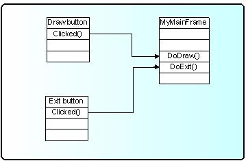
I.e. any button emits the signal Clicked() any time someone clicks on it. As you can see this method is virtual and could be overridden if you need to. In our simple example we call the Connect() method to connect the Clicked() signal of Draw button with MyMainFrame::DoDraw():
In the same way we can connect to the signal Clicked() of the Exit button with the system call gApplication->Terminate(0). We declare a new slot DoExit(), implement it to invoke the termination call and associate this slot with the signal Clicked() of the Exit button.
The code of example.C can be changed as follows:
public:
...
   void DoExit();  // a new slot is added
}
void MyMainFrame::DoExit() {
   gApplication->Terminate(0);
}
MyMainFrame::MyMainFrame(const TGWindow *p,UInt_t w,UInt_t h) {
...
   TGTextButton *exit = new TGTextButton(hframe,"&Exit ");
   // connects signal Clicked() with slot DoExit()
   exit->Connect("Clicked()","MyMainFrame",this,"DoExit()");
...
}
Here is an abstract view of the signal/slots connections in example.C:
To benefit from this mechanism your classes must inherit from TQObject or otherwise the class definition must start with RQ_OBJECT("ClassName")macro. This macro allows the signals/slots communication mechanism to be applied between compiled and interpreted classes in an interactive ROOT session without having the class derive from TQObject. Every signal method declaration is followed by a comment "*SIGNAL*". Only instances of a class that defines a signal or instances of its subclasses can emit the signal. The ROOT implementation of a popular example presenting signals and slots is the next. Let’s have a minimal class declaration:
class MyClass {
private:
   Int_t fValue;
public:
   MyClass()  { fValue=0; }
   Int_t GetValue() const { return fValue; }
   void  SetValue(Int_t);
};
It will become the following as interpreted:
class MyClass {
   RQ_OBJECT("MyClass")
private:
   Int_t fValue;
public:
   MyClass() { fValue=0; }
   Int_t GetValue() const { return fValue; }
   void  SetValue(Int_t); // *SIGNAL*
};
Both class declarations have the same data member and public methods to access the value. By placing the RQ_OBJECT("MyClass") macro inside the MyClass body (MyClass is not inherited from TQObject) we allow this class to use the signal/slot communication. Any instance of this class can tell the outside world that the state of its data member has changed by emitting a signal SetValue(Int_t). A possible implementation of MyClass::SetValue() can be:
The line Emit("SetValue(Int_t)",v) activates the signal SetValue(Int_t) with argument v. You can use any of the methods TQObject::Emit("full_method_name",arguments) to emit a signal. We create two instances of MyClass and connect them together:
MyClass *objA = new MyClass();
MyClass *objB = new MyClass();
objA->Connect("SetValue(Int_t)","MyClass",objB,"SetValue(Int_t)");
objB->SetValue(11);
objA->SetValue(79);
objB->GetValue();          // the value is 79
By calling the method objA->Connect(), objA connects its signal “SetValue(Int_t)” to the “MyClass::SetValue(Int_t)” method (slot) of objB. Next, when you call objA->SetValue(79)object objAemits a signal which objBreceives and objB->SetValue(79)is invoked.
It is executed immediately, just like a normal function call. objB will emit the same signal in turn, but nobody is interested in this signal, since no slot has been connected to it. Signals are currently implemented for all ROOT GUI classes, event handlers (TFileHandler, TSignalHandler, etc.), timers (TTimer) and pads (TPad, TCanvas, etc.). To find all defined signals you just do: grep ‘*SIGNAL*' $ROOTSYS/include/*.h
As a programmer you build the sender-receiver part of object connections using the TQObject::Connect() method. You can connect one signal to many different slots. The slots will be activated in order they were connected to the signal. You can change this order using the methods LowPriority() and HightPriority() of TQObject. Also, many signals can be connected to one slot of a particular object or a slot can be connected to a signal for all objects of a specific class. It is even possible to connect a signal directly to another signal - this will emit the second signal immediately after the first one is emitted.
All signals and slots are normal class methods and can take any number of arguments of any type. The common methods of TQObject that activate a signal with any number and type of parameters are:
With no parameters param the method will be:
param can be a single parameter or an array of Long_t parameters as it is shown below:
TQObject *processor;  // data processor
TH1F     *hist;       // filled with processor results
...
processor->Connect("Evaluated(Float_t, Float_t)", "TH1F", hist,
                   "Fill(Axis_t x, Axis_t y)");
...
Longptr_t args[2];
args[0]=(Longptr_t)processor->GetValue(1);
args[1]=(Longptr_t)processor->GetValue(2);
...
processor->Emit("Evaluated(Float_t, Float_t)", args);
...
To use signals and slot you need something that brings them together. The class TQObject has several methods creating sender-receiver connections. Some of them are static and can be called without having an instance of the class. The ROOT implementation of signals and slots allows connections to any known Cling object. The class name parameter in the Connect() methods must be a class with a dictionary (interpreted classes have an implicit dictionary).
TGButton *button;
TH2      *hist;
...
TQObject::Connect(button,"Clicked()","TH2",hist,"Draw(Option_t*)");
You can replace it with 0 (zero) and in this case the slot string defines a global or interpreted function name. The receiver parameter should be zero too. For example:
To make a single connection from all objects of a class you should write:
The first argument specifies the class name Channel. The signal AllarmOn() of any object of the class Channel is connected to the HandleAllarm() method of the handler object of the class HandlerClass.
In example.C we have used the not-static Connect()method:
It needs to know four things: the signal that should be connected, the receiver class, the object that will receive the signal, and the slot that will be connected to the signal. Because this method is non-static we can write this as a receiver parameter.
In all methods you have to specify the signal and the slot with their names and parameter types. Do not write values instead of types in that place. It is possible to pass a parameter by value to a slot method in the following way:
Connect(myButton, "Pressed()", "TH1", hist, "SetMaximum(=123) ");
Connect(myButton, "Pressed()", "TH1", hist, "Draw(=\"LEGO\")");
As you see the parameter’s value is preceded by the equation symbol (=). Please note that this method of passing arguments by value works only if the signal has less arguments than the slot. If the signal method has the same number of arguments, then the slot argument will be overwritten with the signal argument. In the example below, the Draw option would be overwritten in the first line by the emitted signal argument. The second line would be ok, the argument passed by value would not be overwritten.
Connect(myComboBox, "Selected(const char*)", "TTree", myTree, "Draw(=\"x\")");
Connect(myComboBox, "Selected(const char*)", "TTree", myTree, "Draw(const char*, =\" y==1 \")");
In addition, if the signal and slot arguments differ in argument type, passing arguments by value leads to undefined behaviour and illegal memory access, as the signal argument will be casted to another data type. In the example below, if Selected emits Int_t = 1, then ChangeText will try to read a TString at address 0x1.
You have the possibility to destroy a signal/slot connection by using Disconnect() methods. There are three ways to do this:
1/ to destroy all connections to an object’s signals;
2/ to destroy all connections to a particular object’s signal; 3/ to detach an object from a specific receiver:
Disconnect(myObgect);                     // case 1
Disconnect(myObgect, "mySignal");         // case 2
Disconnect(myObgect,0,myReceiver,0);      // case 3
Three parameters of these methods could be replaced by 0. The meaning in these cases would be “any signal”, “any receiving object”, “any slot of the receiving object”, i.e. 0 is used as a wildcard. The sender parameter cannot be 0, because you can disconnect signals from one given object. If the signal parameter is 0, the receiver and the slot are disconnected from any signal. Giving the name of the signal you disconnect this signal.
In addition to all Qt features the ROOT version of signals/slots gives you the possibility to connect slots to a class. The slots will be executed every time the specified signal is emitted by any object of this class. A slot can have default arguments and it can be either a class method or stand-alone function (compiled or interpreted).
The method TQObject::HasConnection(signale_name) checks if there is an object connected to this signal and returns true if it is the case.
Using TQObject::NumberOfConnections(), TQObject::NumberOfSignals() you can check how many signals or connections has the object.
The rules for using signals/slots mechanism in a standalone executable program do not differ from what was described previously. Let’s remind that
a slot can be any class method with a generated Cling dictionary
a slot can be a function with a dictionary
Detailed information how to generate a dictionary can be found on http://root.cern.ch/root/CintGenerator.html
The following example demonstrates how to use signals/slots mechanism in a standalone executable program on linux platform with the gcc compiler.
tst.C
#include <TQObject.h>
#include <RQ_OBJECT.h>

class A {
   RQ_OBJECT("A")
private:
   Int_t fValue;
public:
   A() : fValue(0) { }
   ~A() { }
   void  SetValue(Int_t value);  // *SIGNAL*
   void  PrintValue() const   { printf("value = %d\n", fValue); }
};
void A::SetValue(Int_t value) {  // Set new value
   // Emit signal "SetValue(Int_t)" with a single parameter
   if (value != fValue) {
      fValue = value;
      Emit("SetValue(Int_t)", fValue);
   }
}
// Main program
#ifdef STANDALONE
int main(int argc, char **argv) {
   A* a = new A();
   A* b = new A();
   a->Connect("SetValue(Int_t)", "A", b, "SetValue(Int_t)");
   printf("n******* Test of SetValue(Int_t) signal *******n");
   b->SetValue(10);
   printf("nt***** b before ******n");
   b->PrintValue();
   a->SetValue(20);
   printf("t***** b after a->SetValue(20) ******n");
   b->PrintValue();
   return 0;
}
#endif
ACLiC simplifies this procedure and allows the dictionary generation by:
It will create the shared library tst_C.so.
The next line will create an executable:
g++ -otst tst.C `root-config --cflags --libs` ./tst_C.so -DSTANDALONE
The library tst_C.so is a dynamically loaded library and should be located in $LD_LIBRARY_PATH. The current working directory should be added to $LD_LIBRARY_PATH via:
export LD_LIBRARY_PATH=$LD_LIBRARY_PATH:./
To run it, you just do:
./tst
Buttons are a popular group of widgets designed to provide specific interfaces for user interaction. TGButton is an abstract class defining the general button behavior: width, height, state, its group, tool tip text, etc.
There are two main groups of buttons: command buttons with a text or graphics inside that indicate the action to be accomplished and option buttons well known as radio and check buttons that select or change properties. The first group is presented in ROOT by TGPictureButton and TGTextButton classes. They yield an action as soon as they are clicked. It can be opening/closing a dialog box or invoking a specific function in an application. Remember the Draw button from the example. The radio and check buttons from the second group are used to select an option. There is a visual difference between these two groups: the text buttons appear “pressed in” only while they are clicked, while the radio and check buttons change their appearance when they are selected and keep that appearance afterwards.
A text button is represented by the class TGTextButton. We already used its constructor in the example. The button label indicates the action to be taken when the button is selected or pressed. The text can be a hot string defining a hot key (known as shortcut key also) for this selection. The hot key is an underlined character in a button label that shows the assigned keyboard mnemonic for its choice. A button that prompts more information for users has the label generally followed by ellipsis (…).

As we saw the hot strings “&Draw” and “&Exit” define the text labels “Draw” and “Exit” and keyboard mnemonics Alt+D, Alt+E for their selection. The letter D and E appear underlined on the screen. All text buttons should have a unique shortcut key with the exception of OK and Cancel.
These buttons are usually placed within a window to provide fast access to frequently used or critical commands. They help in situations where a command is not available through the menu bar. You already know that a command string can be passed in the text button via the constructor:
TGTextButton(const TGWindow *p, const char *s, const char *cmd,
             Int_t id, GContext_t norm, FontStruct_t font,
             UInt_t options);
A button label can be changed by SetText(new_label). There are important guidelines to be followed about a button label. The text has to provide a meaningful description of the performed action. The single-word label should be used whenever possible, only two-three words for clarity, if necessary. Do not number labels. Always follow all platform presentation and usage guidelines for standard button functions. Let’s remember a few standard names and definitions of well known buttons:
OK - any changed information in a window is accepted and the window is closed;
Cancel - closes window without implementing submitted changes;
Reset- resets defaults and cancels any changed information that has not be submitted;
Apply - any changed information is accepted and again displayed in the window that remains open;
Close - closes the window;
Help - opens online Help.
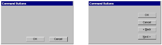
Below are examples of text buttons. Note the two placement methods. The first example should be used when there are one to three command buttons; the second one when there are more than three buttons.
Picture buttons are usually rectangular in shape with an icon or graphics label. These buttons may appear alone or placed in a group at the window’s top or side. They are most frequently used to quickly access commands, many of which are normally accessed through the tool bar. For example, the picture buttons below can be used to provide different styles of a histogram drawing.

Here is the example how to create the first button:
The picture of file h1_s.xpm is used in the button. All .xpm files are located in the directory $ROOTSYS/icons. You can assign a command directly as a parameter of the picture button constructor. The picture of TGPictureButton can be changed by:
The advantage of command buttons is that they are always visible, providing a reminder of their existence. They can be inscribed with a meaningful description of what they do by TGToolTip("Some describing text"). Their activation is much easier and faster than using a two-step menu bar/pull-down sequence. The only disadvantage of the text and picture buttons is that they consume considerable screen space if they are many. Having no more than six command buttons per window or dialog box helps to appropriately balance the application’s effectiveness, its real efficiency, and the operational simplicity.
The classes TGRadioButton and TGCheckButton present the option buttons in ROOT. Like the text buttons, they have text or hot string as a label. Radio buttons are grouped in logical sets of two or more and appear with a text label to the right. The choices are mutually exclusive and only one setting is permitted at one time. They represent visually all alternatives and it is easy to access and compare choices. They facilitate the situations where all alternatives cannot be easily remembered or where displaying the alternatives together helps to understand and select the proper choice. It is very useful to provide a default setting whenever it is possible. When it is not possible to establish a default setting because of the nature of the information, it is better to leave all radio buttons blank.
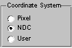
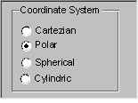
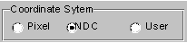
A columnar orientation is the preferred manner of radio buttons presentation. If the vertical space on the window is limited, they can be oriented horizontally. Selection choices should be organized logically in groups. Here is the example that produces the image above:
br = new TGButtonGroup(p,"Coordinate system",kVerticalFrame);
fR[0] = new TGRadioButton(bg,new TGHotString("&Pixel"));
fR[1] = new TGRadioButton(bg,new TGHotString("&NDC "));
fR[2] = new TGRadioButton(bg,new TGHotString("&User "));
fR[1]->SetState(kButtonDown);
br->Show();
It is enough to change kVerticalFrame to kHorizontalFrame in TGButtonGroup constructor and you will have radio buttons aligned horizontally:
The class TGButtonGroup will help you to organize button widgets in a group. There is no need to call AddFrame() since the buttons are added automatically with a default layout hint to their parent by TGButtonGroup::Show() as shown in the previous example. The buttons in the group have assigned identifiers. Any button in a group emits a Clicked() signal with this identifier when it is clicked. This giving an ideal solution to connect several Clicked() signals to one slot.
An exclusive button group switches off all toggle buttons except the selected one. The group is by default non-exclusive but its entire radio buttons will be mutually exclusive.
TGHButtonGroup and TGVButtonGroup are convenience classes that offer you a thin layer on top of TGButtonGroup. TGHButtonGroup organize button widgets in a group of one horizontal row, TGVButtonGroup in a group of one column. You can also organize buttons in rows and columns using the provided constructor and TGMatrixLayout.
Do not use a radio button to indicate the presence or absence of a state - use a check box instead.
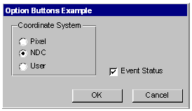
To have the check button “Event Status” and to set it as selected we need to write:
Check boxes show the selected choices and any number of them can be selected, including none. Their proper usage is for setting attributes, properties or values; also for data or choices that are discrete, small and fixed in number, not easily remembered. With check boxes all alternatives are visible: it is easy to access and compare choices because they can all be seen together. Each option acts as a switch and can be either “on” or “off”. It is never changed in contents. Checkboxes differ from radio buttons in that they permit selection of more than one alternative. Each box can be switched on or off independently. These buttons can be used alone or grouped in sets. It is good practice to provide default settings for check boxes whenever it is possible.

This can be done by:
The parameter state can be one of kButtonUp, kButtonDown, kButtonEngaged, kButtonDisabled.
Check boxes can be used to affect other controls. The contents of a list can, for example, be filtered by setting a check box. In any case, use a check box only when both states of a choice are clearly opposite and unambiguous. If opposite states are not clear, it is better to use two radio buttons.
Choice description, i.e. check box label, must be clear, meaningful, fully spelled out, and displayed in mixed-type text. Whenever the use of a given button is inappropriate, for whatever reason, that button should be disabled:
Never make a button appear and disappear.
In general, option buttons should not offer more than eight choices. If the number of choices exceeds this maximum, it is better to use a multiple selection list box.
The method IsToggleButton() gives the information whether a radio button or a check button is selected. An option button can be set or unset via its method PSetState(EButtonState state).
The method HandleKey(event) is called when the defined hotkey is hit for any button. It sets the selected option button or clicks the selected text button and invokes its defined action.
A TGTextEntry is a one-line text input widget. It contains text that is entered or modified through the keyboard. This text may be displayed in different way according to the set echo mode. Users can control them bySetEchoMode(), GetEchoMode() methods.
kNormal - display characters as they are entered (default);
kNoEcho - do not display anything;
kPassword - display asterisks instead of the characters actually entered.
The way in which typed characters are inserted in the text entry is defined by TGTextEntry::EInsertMode and can be toggled by the Insert key:
kInsert - typed character are inserted (cursor has shape of short line)
kReplace - entered characters substitute already typed ones (cursor has the shape of filled rectangle).


There ate different text alignment modes defined by TGWidget::ETextJustification. They are valid until text fits the frame width of the text entry field.
kTextLeft - left-side text alignment
kTextRight - right-side text alignment
kTextCenterX - center text alignment along x direction
kTextTop - top-side text alignment
kTextBottom - bottom-side text alignment
kTextCenterY - center text alignment along y direction
The TGNumberEntry class present number entry widgets. A number entry is a single-line field followed by two small, vertically arranged up-down buttons. Its purpose is to make a selection by either scrolling through a small set of meaningful predefined choices or typing numbers. The TGNumberFormat class contains enum types to specify the numeric format. The number entry widget is based on TGTextEntry. It allows only numerical input. The widget supports numerous formats including integers, hex numbers, real numbers, fixed fraction real and time/date formats. It also allows to restrict input values to non-negative or positive numbers and to specify explicit limits.
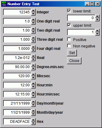
The following styles are supported:
kNESInteger - integer number
kNESRealOne - real number with one digit (no exponent)
kNESRealTwo - real number with two digits (no exponent)
kNESRealThree - real number with three digits (no exponent)
kNESRealFour - real number with four digits (no exponent)
kNESReal - arbitrary real number
kNESDegree - angle in degree:minutes:seconds format
kNESMinSec - time in minutes:seconds format
kNESMinSecCent - time in minutes:seconds.centiseconds format
kNESHourMin - time in hour:minutes format
kNESHourMinSec - time in hour:minutes:seconds format
kNESDayMYear - date in day/month/year format
kNESMDayYear - date in month/day/year format
kNESHex- hexadecimal number
The following attributes can be specified:
kNEAAnyNumber - any number is allowed
kNEANonNegative - only non-negative numbers are allowed
kNEAPositive - only positive numbers are allowed
Explicit limits can be specified individually:
kNELNoLimits - no limits
kNELLimitMin - lower limit only
kNELLimitMax - upper limit only
kNELLimitMinMax - both lower and upper limits
fN1 = new TGNumberEntry(parent, 0.005, 9, kENTRY1,
         TGNumberFormat::kNESRealThree,   //style
         TGNumberFormat::kNEAAnyNumber,   //input value filter
         TGNumberFormat::kNELLimitMinMax, //specify limits
         -1.,1.);                         //limit values
TGNumberEntryField is a number entry input widget.
Nent = new TGNumberEntryField(hgrunf2, kNENT_ID, 0.6,
                              TGNumberFormat::kNESRealThree,
                              TGNumberFormat::kNEAAnyNumber);
TGNumberEntryField is a plain vanilla entry field, whereas TGNumberEntry adds two small buttons to increase and decrease the numerical value in the field. The number entry widgets also support using the up and down cursor keys to change the numerical values. The step size can be selected with control and shift keys:
–small step (1 unit/factor of 3)
Shift medium step (10 units/factor of 10)
Controllarge step (100 units/factor of 30)
Shift+Controlhuge step (1000 units/factor of 100)
The steps are either linear or logarithmic. The default behavior is set when the entry field is created, but it can be changed by pressing the alt key at the same time.
Menus provide a list of commands or options helping the user to select and to perform a task. The menu system classes are TGMenuBar, TGMenuTitle, TGPopupMenu, and TGMenuEntry.
The TGMenuBar class implements a menu bar widget. It is used to specify and provide access to common and frequently used application actions described in menu titles, implemented by TGMenuTitle class. The menu bar is the highest-level of the menu system and it is a starting point for all interactions. Also, it is always visible and allows using the keyboard equivalents. The geometry of the menu bar is automatically set to the parent widget, i.e. the menu bar automatically resizes itself so that it has the same width as its parent (typically TGMainFrame).
The menu bar is as a container for its menus - objects of the type TGPopupMenu. Popup menus can appear in a menu bar. They can be a sub-menu of another popup menu (cascading menus) or can be standalone (as a context menu). They are made of one or more menu items choices. When displayed, the menu items are arranged in a vertical list. Usually they correspond to actions (e.g. Open). These items can be labeled with text, graphics or a combination of both. Each of them should have a character defined as its unique key for access. Grouped logically by their functionality, they are separated visually by menu separators in groups. For example, The File menu is a common menu title for tasks that apply to a file, as Open,Save,Close,Print…
// a popup menu
fMenuFile = new TGPopupMenu(gClient->GetRoot());

// adding menu entries
fMenuFile->AddEntry("&Open...",M_FILE_OPEN);
fMenuFile->AddEntry("&Save",M_FILE_SAVE);
fMenuFile->AddEntry("S&ave as...",M_FILE_SAVEAS);
fMenuFile->AddEntry("&Close", -1);

// adding separator
fMenuFile->AddSeparator();

// next group of menu entries
fMenuFile->AddEntry("&Print",M_FILE_PRINT);
fMenuFile->AddEntry("P&rint setup...",M_FILE_PRINTSETUP);
. . .
fMenuFile->AddSeparator();
fMenuFile->AddEntry("E&xit",M_FILE_EXIT);
First we create the File menu by creating an object of classTGPopupMenu and adding menu entries with AddEntry method. Its first parameter is a hot string, the second - a menu ID. The ampersand character (&) denotes shortcut for each menu entry; you can use the letter after it to manage the menu via keyboard. There are three groups of menu entries separated visually by two separators.
You can add a sub-menu by using the method TGPopupMenu::AddPopup. Its first parameter is again a string, the second one - a pointer to a TGPopupMenu object that will appear as a sub-menu when the menu entry will be selected. The often used visual indicator of a sub- menu is a right-facing arrow to the right of the parent menu item. Generally only one level of cascading menus is recommended and you should be careful in using more. Next lines show how to create a menu bar with File,Test and Help menus:
// menu bar item layout hints
fMBItemLayout = new TGLayoutHints(kLHintsTop|kLHintsLeft,0,4,0,0);
fMBHelpLayout = new TGLayoutHints(kLHintsTop|kLHintsRight);

// menu bar
fMenuBar = new TGMenuBar(fMain,100,20,kHorizontalFrame);

// adding popup menus
fMenuBar->AddPopup("&File", fMenuFile, fMBItemLayout);
fMenuBar->AddPopup("&Test", fMenuTest, fMBItemLayout);
fMenuBar->AddPopup("&Help", fMenuHelp, fMBHelpLayout);
Using the method TGMenuBar::AddPopup we add three TGPopupMenu objects to the menu bar fMenuBar. The first parameter is a hot string used by TGMenuTitle object. When you add a popup menu to the menu bar, a TGMenuTitle object is created by the menu bar. It is the name of the popup menu. A menu title should have a one-word name that reflects the purpose of all items within the corresponding popup menu. It should also have a defined character as its unique access key. The second parameter is the popup menu we would like to add. The third one is an object of TGLayoutHints type that defines how the menu title will be laid out in the menu bar. In our example the File and Test menus will be laid out to the left of the menu bar with 4 pixels distance in between, the Help menu - will be laid out to the right.
The menu classes provide a very flexible menu system: you can enable, disable, add or remove menu items dynamically. The method HideEntry(menuID) hides the menu entry (the entry will not be shown in the popup menu). To enable a hidden entry you should call EnableEntry(menuID) method. By default all entries are enabled. The method DisableEntry(menuID) helps you to disable a menu entry - it will appear in sunken relieve. The DeleteEntry(menuID) method will delete the specified entry from the menu.
A few words about the menu design. A menu should be kept consistent and simple. All related items need to be in a popup menu. The cascade menus should be used judiciously. Try to limit them to one, maximum two levels.
There are some rules for naming the menu objects:
Define unique names within a menu
Use capitalized one-word names allowing the quick scan of the menu
Define unique access key for any menu item
Indicate by ellipsis (…) after the title with no space when a menu item will pop-up a dialog box
The proper kind of graphical menus is a critical point to every application success and depends of three main factors:
number of presented items in the menu
how often the menu is used
how often the menu contents may change
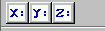
A toolbar (TGToolBar) is a composite frame that contains TGPictureButtonobjects. It provides an easy and fast access to most frequently used commands or options across multiple application screens. Also, it invokes easily a sub application within an application. All its functions can be obtained by application menus. It is located horizontally at the top of the main window just below the menu bar. All other subtask and sub-feature bars are positioned along sides of window.
// toolbar icon files
const char *xpms[] = {
   "x_pic.xpm",
   "y_pic.xpm",
   "z_pic.xpm",
   0
};
// toolbar tool tip text
const char *tips[] = {
   "X Settings",
   "Y Settings",
   "Z Settings",
   0
};
// toolbar button separator
int separator = 5;

// structure containing toolbar button information
ToolBarData_t t[3];

// creation of a toolbar object as a child of main frame
TGToolBar *tb = new TGToolBar(fMain,520,80);

for (int i = 0; i < 3; i++) {
   // filling the ToolBarData_t with information
   t[i].fPixmap   = xpms[i];   // icon file
   t[i].fTipText  = tips[i];   // tool tip text
   t[i].fStayDown = kFALSE;    // button behavior if clicked
   t[i].fId = i+1;             // button id
   t[i].fButton = NULL;        // button pointer

   if (strlen(xpms[i]) == 0) {
      separator = 5;
      continue;
   }
   tb->AddButton(fMain,&t[i],separator);
   separator = 0;
}
// adding the tool bar to the main frame
fMain->AddFrame(tb, new TGLayoutHints(kLHintsTop|kLHintsExpandX));

// adding a horizontal line as a separator
TGHorizontal3DLine *lh = new TGHorizontal3DLine(fMain);
fMain->AddFrame(lh, new TGLayoutHints(kLHintsTop|kLHintsExpandX));
To have a tool bar in your application you do not need to do anything special - only to create objects: a tool bar and its picture buttons. This sample code creates the following three toolbar buttons:
First we need to complete a ToolBarData_t structure for each tool bar button before adding it to the tool bar. This structure contains:
the icon file name “filename.xpm”
the tool tip text - a short help message explaining the button purpose
the Boolean variable defining the button behavior when is clicked
kFALSE - do not stay down
kTRUE - to stay down
the button ID
the button pointer (TGButton *) - should be NULL
We create an array *xpms[] containing the icon file names that will be used for a picture button creation. If you write only the file names here ROOT will search these files in $ROOTSYS/icons directory. If the icon files are not there, you should provide the full path name also. The array *tips[]contains the tool tip texts for buttons. The integer variable separator is used to set the distance between two groups of toolbar buttons. It defines the amount of pixels to the left for each button.
We create a tool bar object and add the buttons using the AddButton method. The variable separator helps us to define no space between the buttons in a group (0), and 5 pixels extra-space before and after. All buttons added via this method will be deleted by the toolbar. On return the TGButton field of the ToolBarData_t structure is filled in (if the icon pixmap was valid). The first parameter is the window to which the button messages will be sent. Lastly, we create an object of class TGHorizontal3DLine - a horizontal 3D line. It will separate the toolbar from the menu bar because the layout hints we define as kLHintsTop | kLHintsExpandX.
It is user friendly to allow the possibility for the tool bar to be turned on or off (via a menu). If you use a single tool bar, it should fill the complete width of its parent. When using more than one, you should also think about setting the bar size to the end of the most right button. This way other bars can be displayed in the same row below the menu bar.
Tool bar buttons should have equal size, meaningful and unique icons, and short meaningful tool tip text. The related buttons should be grouped together by frequency or sequence of use, or importance. Potentially destructive buttons must be separated from them to avoid accidental activation and potentially catastrophic results. Temporarily not available items should be displayed grayed out.
The purpose of a list box is to display a collection of items from which single or multiple selection can be made. It is always visible, having a scroll bar when the displayed area is not enough to show all items. The choices may be mutually exclusive (a list box with single selection) or not mutually exclusive (a list box with multiple selection).
The proper usage of the list boxes is for selecting values, or objects, or setting attributes. You have to create them to display 4 to 8 choices at one time (3 is a required minimum in case of lack of screen space). The list should contain not more than 40 items accessible by scrolling view (vertical scroll bar). If more are required, you should provide a method for using search criteria or scoping the options. The best list boxes use is for textual data or choices. They should be wide enough to display fully all items. When it is not possible, break the long items with ellipsis and provide tool tip that displays the full item text.
The list box widget is represented by TGListBox, TGLBContainer, TGLBEntry and TGTextLBEntry classes. Currently entries are simple text strings (TGTextLBEntry). A TGListBox looks a lot like a TGCanvas. It has a TGViewPort containing a TGLBContainer which contains the entries and it also has a vertical scrollbar which becomes visible if there are more items than fit in the visible part of the container. The TGListBox is user callable. The other classes are service classes of the list box. Here is a sample code showing how to create a list box with ten entries:
// list box widget containing 10 entries
int fFirstEntry = 0, fLastEntry = 10;
char tmp[20];
TGListBox *fListBox = new TGListBox(parent, 90);
for (i = fFirstEntry; i < fLastEntry; i++) {
   sprintf(tmp, "Entry %i", i+1);
   fListBox->AddEntry(tmp, i);
}
fListBox->Resize(150, 80);
parent->AddFrame(fListBox,new TGLayoutHints(kLHintsTop|kLHintsLeft,
                                            5, 5, 5, 5));
We create the list box widget passing the parent window pointer and giving an ID number. Next we add entries with specified string and ID to the list box. Before adding the list box to its parent widget, it should be resized via Resize(width, height) method. The list box width and height are in pixels. The default entry layout hints are kLHintsExpandX | kLHintsTop. If you want to add entries using different ones, call the method:
It adds the specified TGLBEntry and TGLayoutHints to the list box. There are several methods providing a flexible entry manipulation: you can insert, add or remove list box items dynamically. The list box entry IDs are used in these methods and also in event processing routines. In our example the integer variables fFirstEntry and fLastEntry contain the information about the first and last entry IDs. You can add or remove a list box entry using them in the following way:
// adding an entry
fLastEntry++;
sprintf(tmp, "Entry %i", fLastEntry);
fListBox->AddEntry(tmp, fLastEntry);
fListBox->MapSubwindows();
fListBox->Layout();
. . .
// removing an entry
if (fFirstEntry < fLastEntry) {
fListBox->RemoveEntry(fFirstEntry);
fListBox->Layout();
fFirstEntry++;
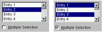
}A single-selection list box is used for selecting only one item in a list.
A multiple-selection list box permits selection of more than one item. The selected choices should be visible - you have several choices to do this:
to mark selected choices with a check mark or highlight them
to provide a summary list box to the right of the list box, containing the selected choices
to provide a display-only text control indicating the number of selected choices (its position should be justified upper-right above the list box)
if the actions Select All or Deselect All must be quickly or frequently performed, use command buttons
A combo box is as single-selection list box that shows only the currently selected entry and a prompt button displayed as a downward arrow. The prompt button provides a visual cue that a list box is hidden. Its main advantage is consuming of quite a bit of screen space. When the user clicks on it, a list pops up, from which a new choice can be made. After a new item is chosen the combo box folds again showing the new selection.
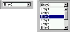
The combo box widget is represented by the user callable class TGComboBox. The class TGComboBoxPopup is a service class. The combo box constructor is very similar to the list box one. The first parameter is a parent widget pointer again, the second - an integer value that will be used as combo box ID. The method used for adding entries is very similar to the list box method we used before. The method Select(entryID) sets the current combo box entry.
char tmp[20];
// combo box layout hints
fLcombo = new TGLayoutHints(kLHintsTop | kLHintsLeft,5,5,5,5);
// combo box widget
TGComboBox *fCombo = new TGComboBox(parent,100);
for (i = 0; i < 10; i++) {
   sprintf(tmp, "Entry%i", i+1);
   fCombo->AddEntry(tmp, i+1);
}
fCombo->Resize(150, 20);
// Entry3 is selected as current
fCombo->Select(2);
parent->AddFrame(fCombo, fLcombo);
You have the same flexibility to add, insert or remove entries. As with list boxes you can retrieve the information for currently selected item via GetSelected or GetSelectedEntry methods. The first one returns the entry ID, the second - the current entry pointer (TGLBEntry *).
A slider is a scale with an indicator (slider) that you can drag to choose a value from a predefined range. It may be oriented horizontally or vertically. In both cases it provides an excellent indication of where a value exists within a range of values.

The class TGHSlider represents the horizontal slider; TGVSlider - the vertical one. Both inherit from the base class TGSlider that creates the main slider parameters: the range of values within a value can be selected; the indicator type; the tick mark scale. Using its methods SetRange, SetPosition and SetScale you can set these parameters. To retrieve the set slider value you can call GetPosition method.
Next sample code creates a horizontal slider hslider with a tick mark of type kSlider1. Its width is 150 pixels, and its scale is placed down (kScaleDownRight). The last parameter in the TGHSlider constructor is the slider ID. It will be used for event processing. The methods SetRange and SetPosition set the range and the current tick mark position of the slider.
hslider = new TGHSlider(parent,150,kSlider1|kScaleDownRight,sID);
hslider->SetRange(0,50);
hslider->SetPosition(39);
Slider values can be set by using the mouse to drag the slider across the scale until the desired value is reached. Another way is to click in the slider trough instead of dragging.
Double slider widgets allow easy selection of a min and a max value out of a range. They can be either horizontal or vertical oriented. There is a choice of different types of tick marks: kDoubleScaleNo, kScaleDownRight, kDoubleScaleBoth.
To change the min value you should press the left mouse button near to the left (TGDoubleHSlider) or bottom (TGDoubleHSlider) edge of the slider. Alternatively, to change the max value you need to press the mouse near to the right (TGDoubleHSlider) or top (TGDoubleHSlider) edge of the slider. To change both values simultaneously you should press the left mouse button near to the center of the slider.
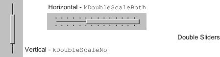
TGDoubleSlider is an abstract base class that creates the main slider parameters. The concrete class to use for a vertical double slider is TGDoubleVSlider and TGDoubleHSlider for a horizontal one. The double slider constructors are similar to those of the other sliders. If you set kDoubleScaleNo as a scale parameter no scale will be drawn. Here is an example:
The new TGTripleHSlider and TGTripleVSlider classes inherit from the double slider widgets and allow easy selection of a range and a pointer value. The pointer position can be constrained into the selected range or can be relative to it.
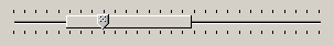
To change the slider range value press the left mouse button near to the left/right (top/bottom) edges of the slider. To change both values simultaneously press the mouse button near to the slider center. To change pointer value press the mouse on the pointer and drag it to the desired position.
fSlider = new TGTripleHSlider(parent,100,kDoubleScaleBoth,kSLD_ID,
                              kHorizontalFrame);
parent->AddFrame(fSlider,new TGLayoutHints(kLHintsExpandX,5,5,5,5));
fSlider->SetConstrained(kTRUE);
fSlider->SetRange(rmin, rmax);
fSlider->SetPosition(pmin, pmax);
fSlider ->SetPointerPosition(pvalue);A progress bar is a widget that shows that an operation is in progress and how much time is left. It is a long rectangular bar, initially empty, that fills with a color as a process is being performed. The filled-in area indicates the percentage of the process that has been completed. You should use this widget for waits exceeding one minute. For a very time consuming operation it is better to break the operation into subtasks and provide a progress bar for each of them.
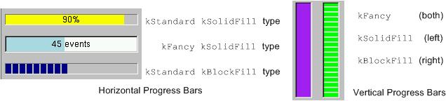
A progress bar may be oriented horizontally or vertically. The horizontally oriented progress bar fills with a color from left to right; the vertically oriented - from bottom to top. A percent complete message provides an indication of the completed part of the process. It is a good practice to include some descriptive text of the process to keep users informed and entertained while they are waiting for process completion.
The picture below shows the progress bars you can create using the classes TGProgressBar, TGHProgressBar, and TGHProgressBar.
// vertical frame with three horizontal progressive bars
TGVerticalFrame *vframe = new TGVerticalFrame(fMain, 10, 10);
fHProg1 = new TGHProgressBar(vframe,TGProgressBar::kStandard,300);
fHProg1->ShowPosition();
fHProg1->SetBarColor("yellow");
fHProg2 = new TGHProgressBar(vframe,TGProgressBar::kFancy,300);
fHProg2->SetBarColor("lightblue");
fHProg2->ShowPosition(kTRUE,kFALSE,"%.0f events");
fHProg3 = new TGHProgressBar(vframe,TGProgressBar::kStandard,300);
fHProg3->SetFillType(TGProgressBar::kBlockFill);

vframe->AddFrame(fHProg1,new TGLayoutHints(kLHintsTop|kLHintsLeft|
                                        kLHintsExpandX,5,5,5,10));
vframe->AddFrame(fHProg2,new TGLayoutHints(kLHintsTop|kLHintsLeft|
                                        kLHintsExpandX,5,5,5,10));
vframe->AddFrame(fHProg3,new TGLayoutHints(kLHintsTop|kLHintsLeft|
                                        kLHintsExpandX,5,5,5,10));
vframe->Resize(200, 200);The classes TGLabel and TGIcon show some information - text or graphics. The line below creates a label object. The syntax is very simple: you specify the parent widget and a string object holding the desired text.
Next sample creates an icon object. First we create an object of type TGPicture. The TGPicture objects are never created directly by the application code. We call TGClient telling it the pixmap’s file name to create a TGPicture object and, in turn, it will return a pointer to the created object. If the pixmap file cannot be found the returned pointer will be NULL. As usual, the first parameter of a TGIcon constructor is the parent frame. The second one is the TGPicture object holding the pixmap we want to show. Last two parameters define the width and height of pixmap in pixels. In the end we add the created icon object to its parent.
// icon widget
const TGPicture *ipic=(TGPicture *)gClient->GetPicture("leaf.xpm");
TGIcon *icon = new TGIcon(parent,ipic,40,40);
parent->AddFrame(icon,new TGLayoutHints(kLHintsLeft|kLHintsBottom,
                                        1, 15, 1, 1));
The TGPicture objects are cached by TGClient in order to keep the resource usage low and to improve the efficiency of the client-server windowing systems. TGClient will check whether a pixmap with the same name was already loaded before to register a new picture object. If it finds it, it will return a pointer to the existing object. Also, it will increase the usage counter for the object.
All TGPicture objects are managed by the class TGPicturePool. TGClient creates an object of this type upon initialization. Normally your application program does not deal directly with this class because all manipulations go through TGClient class.
Once you have finished with using of the TGPicture object, you should call the method TGClient::FreePicture(const TGPicture *pic) to free it. The usage counter of the picture object will be decreased and when it reaches zero - the TGPicture object will be deleted.
The status bar widget is used to display some information about the current application state: what is being viewed in the window, a descriptive message about selected objects, or other no interactive information. It may also be used to explain highlighted menu and tool bar items.
An application can only have one status bar at a time.
There is nothing special to create a status bar in your application. You should decide how many fields you need to present the current application state to the user. By default a status bar consists of one part. Multiple parts can be created by SetParts method. Its first parameter is an array of integers that give the percentage size of each part. The second parameter gives the number of status bar parts. Using SetText method you can set a text for any part.
// status bar
Int_t parts[] = {33, 10, 10, 47};
fStatusBar = new TGStatusBar(fMain,50,10,kHorizontalFrame);
fStatusbar->SetParts(parts,4);
fMain->AddFrame(fStatusBar, new TGLayoutHints(kLHintsBottom |
                kLHintsLeft | kLHintsExpandX, 0, 0, 2, 0));
. . .
// fill status bar fields with information; selected is the object
// below the cursor; atext contains pixel coordinates info
fStatusBar->SetText(selected->GetTitle(),0);
fStatusBar->SetText(selected->GetName(),1);
fStatusBar->SetText(atext,2);
fStatusBar->SetText(selected->GetObjectInfo(px,py),3);A window can be split into two parts (panes) by using a horizontal or a vertical splitter. A horizontal splitter resizes the frames above and below of it; a vertical splitter resizes the frames left and right of it.
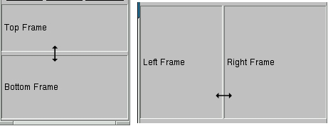
This widget is represented by TGSplitter, TGHSplitter, and TGVSplitter classes. Currently there is no special graphics representation for splitter widgets; only the cursor changes when crossing a splitter.
There is nothing special to create a splitter - two lines of code only:
You call a horizontal TGHSplitter or a vertical TGVSplitter splitter constructor and after you set the frame to be resized via SetFrame method. In spite of that, there are rules to be followed when you create a splitter in your application.
For a horizontal splitter they are:
the parent of a horizontal splitter must inherit from TGCompoziteFrame and must have a vertical layout
the above resized frame must have kFixedHeight option set
use layout hints kLHintsTop | kLHintsExpandX when adding the above resized frame to its parent
use layout hints kLHintsBottom | kLHintsExpandX | kLHintsExpandY when adding the bottom resized frame to its parent
set the above frame to be resized using SetFrame method; the second parameter should be kTRUE
You can see these rules in the code below:
// Create horizontal splitter
fVf = new TGVerticalFrame(fMain,10,10);
fH1 = new TGHorizontalFrame(fVf,10,10, kFixedHeight);
fH2 = new TGHorizontalFrame(fVf,10,10);
fFtop = new TGCompositeFrame(fH1,10,10, kSunkenFrame);
fFbottom = new TGCompositeFrame(fH2,10,10,kSunkenFrame);
fLtop = new TGLabel(fFtop,"Top Frame");
fLbottom = new TGLabel(fFbottom,"Bottom Frame");
fFtop->AddFrame(fLtop, new TGLayoutHints(kLHintsLeft |
kLHintsCenterY,3,0,0,0));
fFbottom->AddFrame(fLbottom, new TGLayoutHints(kLHintsLeft |
kLHintsCenterY,3,0,0,0));
fH1->AddFrame(fFtop, new TGLayoutHints(kLHintsTop |
kLHintsExpandY | kLHintsExpandX,0,0,1,2));
fH2->AddFrame(fFbottom,new TGLayoutHints(kLHintsTop |
kLHintsExpandY | kLHintsExpandX,0,0,1,2));
fH1->Resize(fFtop->GetDefaultWidth(),fH1->GetDefaultHeight()+20);
fH2->Resize(fFbottom->GetDefaultWidth(),fH2->GetDefaultHeight()+20);
fVf->AddFrame(fH1, new TGLayoutHints(kLHintsTop | kLHintsExpandX));
TGHSplitter *hsplitter = new TGHSplitter(fVf);
hsplitter->SetFrame(fH1,kTRUE);
fVf->AddFrame(hsplitter,new TGLayoutHints(kLHintsTop |
kLHintsExpandX));
fVf->AddFrame(fH2, new TGLayoutHints(kLHintsBottom |
kLHintsExpandX | kLHintsExpandY));For a vertical splitter the rules are:
the parent of a vertical splitter must inherit from TGCompoziteFrame and must have a horizontal layout
the left resized frame must have kFixedWidth option set
use layout hints kLHintsLeft | kLHintsExpandY when adding the left resized frame to the parent
use layout hints kLHintsRight|kLHintsExpandX |kLHintsExpandY when adding the right resized frame to the parent
set the left frame to be resized using SetFrame method; the second parameter should be kTRUE
Next is a sample code for a vertical splitter:
// Create vertical splitter
fHf = new TGHorizontalFrame(fMain, 50, 50);
fV1 = new TGVerticalFrame(fHf, 10, 10, kFixedWidth);
fV2 = new TGVerticalFrame(fHf, 10, 10);
fFleft = new TGCompositeFrame(fV1, 10, 10, kSunkenFrame);
fFright = new TGCompositeFrame(fV2, 10, 10, kSunkenFrame);

fLleft = new TGLabel(fFleft, "Left Frame");
fLright = new TGLabel(fFright, "Right Frame");

fFleft->AddFrame(fLleft, new TGLayoutHints(kLHintsLeft |
                 kLHintsCenterY,3,0,0,0));
fFright->AddFrame(fLright, new TGLayoutHints(kLHintsLeft |
                  kLHintsCenterY,3,0,0,0));
fV1->AddFrame(fFleft,new TGLayoutHints(kLHintsTop |
              kLHintsExpandX | kLHintsExpandY,0,0,5,5));
fV2->AddFrame(fFright,new TGLayoutHints(kLHintsTop |
              kLHintsExpandX | kLHintsExpandY, 0, 0, 5, 5));
fV1->Resize(fFleft->GetDefaultWidth()+20, fV1->GetDefaultHeight());
fV2->Resize(fFright->GetDefaultWidth(), fV1->GetDefaultHeight());
fHf->AddFrame(fV1,new TGLayoutHints(kLHintsLeft | kLHintsExpandY));

splitter = new TGVSplitter(fHf,2,30);
splitter->SetFrame(fV1, kTRUE);
fHf->AddFrame(splitter,new TGLayoutHints(kLHintsLeft |
                                         kLHintsExpandY));
fHf->AddFrame(fV2,new TGLayoutHints(kLHintsRight | kLHintsExpandX |
kLHintsExpandY));When all display information cannot be presented in a window, the additional information must be found and made visible. A TGCanvas is a frame containing two scrollbars (horizontal and vertical) and a viewport (TGViewPort). The viewport acts as the window through which we look at the contents of the container frame. A TGContainer frame manages a content area. It can display and control a hierarchy of multi-column items, and provides the ability to add new items at any time. By default it doesn’t map sub-windows, which are items of the container. In this case sub-window must provide DrawCopy method, see for example TGLVEntry class. It is also possible to use option which allows mapping sub-windows. This option has much slower drawing speed in case of more than 1000 items placed in container. To activate this option the fMapSubwindows data member must be set to kTRUE (for example TTVLVContainer class).
A scroll bar only is available when scrolling is necessary. It consists of three elements: a slider box and two directional scroll arrows (buttons).
fCanvas = new TGCanvas(parent, w, h);
fContents = new TGListTree(fCanvas, kHorizontalFrame);
fContents->Associate(parent);
parent->AddFrame(fCanvas, new TGLayoutHints(kLHintsExpandX |
                                            kLHintsExpandY));
// or
fCanvas = new TGCanvas(parent, w, h);
fContents = new TGListTree(fCanvas->GetViewPort(),100,100,
                           kHorizontalFrame);
fContents->SetCanvas(fCanvas);
fContents->Associate(parent);
fCanvas->SetContainer(fContents);
parent->AddFrame(fCanvas, new TGLayoutHints(kLHintsExpandX |
                                            kLHintsExpandY));
The TGContainer class can handle the following keys:
F7, Ctnrl-Factivate a search dialog
F3, Ctnrl-Gcontinue to search
Endgo to the last item in container
Homego to the first item in container
PageUpnavigate up
PageDownnavigate down
arrow keysnavigate inside container
Return/Enterequivalent to double click of the mouse button
Contrl-Aselect all items
Spaceinvert selection.
This class creates a TGCanvas in which a well known ROOT TCanvas is embedded. A pointer to the TCanvas can be obtained via the GetCanvas() member function.
fEc1 = new TRootEmbeddedCanvas("ec1",fParent,100,100);
fParent ->AddFrame(fEc1, new TGLayoutHints(kLHintsExpandX |
                                           kLHintsExpandY));
fEc2 = new TRootEmbeddedCanvas("ec2",fParent,100,100);
fParent ->AddFrame(fEc2, new TGLayoutHints(kLHintsExpandX |
                                           kLHintsExpandY));
fEc1->GetCanvas()->SetBorderMode(0);
fEc2->GetCanvas()->SetBorderMode(0);
fEc1->GetCanvas()->SetBit(kNoContextMenu);
fEc1->GetCanvas()->Connect("ProcessedEvent(Int_t,Int_t,Int_t,TObject*)",
        "MyClass", this, "HandleMyCanvas(Int_t,Int_t,Int_t,TObject*)");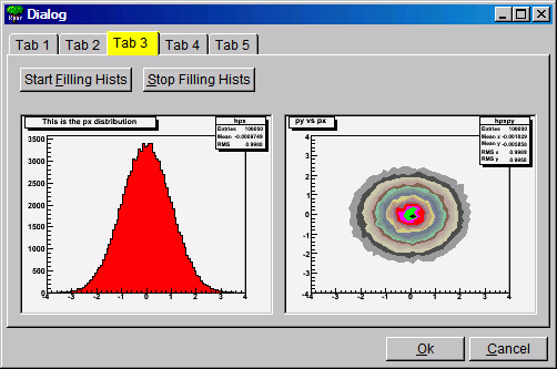
To embed a canvas derived from a TCanvas do the following:
TRootEmbeddedCanvas *embed = new TRootEmbeddedCanvas(0, p, w, h);
// note name must be 0, not null string ""
Int_t wid = embed->GetCanvasWindowId();
TCanvas *myc = new TCanvas("myname",10,10,wid);
embed->AdoptCanvas(myc);
// the TCanvas is adopted by the embedded canvas and will be
// destroyed by itEverything drawn in a ROOT canvas is an object. There are classes for all objects, and they fall into hierarchies. In addition, the ROOT has fully cross-platform GUI classes and provides all standard components for an application environment with common ‘look and feel’. The object-oriented, event-driven programming model supports the modern signals/slots communication mechanism. It handles user interface actions and allows total independence of interacting objects and classes. This mechanism uses the ROOT dictionary information and the Cling the C++ Interpreter to connect signals to slots methods.
Therefore, all necessary elements for an object-oriented editor design are in place. The editor complexity can be reduced by splitting it into discrete units of so-called object editors. Any object editor provides an object specific GUI. The main purpose of the ROOT graphics editor is the organization of the object editors’ appearance and the task sequence between them.
Every object editor follows a simple naming convention: to have as a name the object class name concatenated with ‘Editor’ (e.g. for TGraph objects the object editor is TGraphEditor). Thanks to the signals/slots communication mechanism and to the method DistancetoPrimitive() that computes a ‘‘distance’’ to an object from the mouse position, it was possible to implement a signal method of the canvas that says which is the selected object and to which pad it belongs. Having this information the graphics editor loads the corresponding object editor and the user interface is ready for use. This way after a click on ‘axis’—the axis editor is active; a click on a ‘pad’ activates the pad editor, etc.
The algorithm in use is simple and is based on the object-oriented relationship and communication. When the user activates the editor, according to the selected object <obj> in the canvas it looks for a class name <obj>Editor. For that reason, the correct naming is very important. If a class with this name is found, the editor verifies that this class derives from the base editor class TGedFrame. If all checks are satisfied, the editor makes an instance of the object editor. Then, it scans all object base classes searching the corresponding object editors. When it finds one, it makes an instance of the base class editor too.
Once the object editor is in place, it sets the user interface elements according to the object’s status. After that, it is ready to interact with the object following the user actions.
The graphics editor gives an intuitive way to edit objects in a canvas with immediate feedback. Complexity of some object editors is reduced by hiding GUI elements and revealing them only on users’ requests.
An object in the canvas is selected by clicking on it with the left mouse button. Its name is displayed on the top of the editor frame in red color. If the editor frame needs more space than the canvas window, a vertical scroll bar appears for easy navigation.
The next rules describe the path to follow when creating your own object editor that will be recognized and loaded by the graphics editor in ROOT, i.e. it will be included as a part of it.
Derive the code of your object editor from the base editor class TGedFrame.
Keep the correct naming convention: the name of the object editor should be the object class name concatenated with the word ‘Editor'.
Provide a default constructor.
Use the signals/slots communication mechanism for event processing.
Implement the virtual method SetModel(TObject *obj) where all widgets are set with the current object’s attributes. This method is called when the editor receives a signal from the canvas saying that an object is the selected.
Implement all necessary slots and connect them to appropriate signals that GUI widgets send out. The GUI classes in ROOT are developed to emit signals whenever they change a state that others might be interested. As we noted already, the signals/slots communication mechanism allows total independence of the interacting classes.
GED-frames are constructed during traversal of class hierarchy of the selected object, executed from method TGedEditor::SetModel(). When a new object of a different class is selected, the unneeded GED-frames are cached in memory for potential reuse. The frames are deleted automatically when the editor is closed.
Note: A deep cleanup is assumed for all frames put into the editor. This implies:
do not share the layout-hints among GUI components;
do not delete child widgets in the destructor as this is done automatically.
Sometimes you might need to use several tabs to organize properly your class-editor. Each editor tab is a resource shared among all the class-editors. Tabs must be created from the constructor of your editor-class by using the method:
It returns a pointer to a new tab container frame ready for use in your class. If you need to hide/show this frame depending on the object’s status, you should store it in a data member. See for examples: TH1Editor, TH2Editor.
Full control over base-class editors can be achieved by re-implementing virtual method void TGedFrame::ActivateBaseClassEditors(TClass *cl). It is called during each compound editor rebuild and the default implementation simply offers all base-classes to the publishing mechanism.
To prevent inclusion of a base-class into the compound editor, call:
Pointer to the compound GED-editor is available in TGedFrame‘s data-member:
Ordering of base-class editor frames follows the order of the classes in the class hierarchy. This order can be changed by modifying the value of TGedFrame’s data member Int_t fPriority. The default value is 50; smaller values move the frame towards to the top. This priority should be set in the editor constructor.
Drag and Drop support is introduced for Linux (via Xdnd - the drag and drop protocol for X window system) and for Windows (via Clipboard). Users can selects something in ROOT with a mouse press, drags it (moves the mouse while keeping the mouse button pressed) and releases the mouse button someplace else. When the button is released the selected data is “dropped” at that location. This way, a histogram from an opened ROOT file in the browser can be dragged to any TCanvas.
A script file from the browser can be dropped to a TGTextView or TGTextEdit widget in TGTextEditor.
On Linux, it is possible to drag objects between ROOT and an external application. For example to drag a macro file from the ROOT browser to the Kate editor. On Windows, drag and drop works only within a single ROOT application (for the time being), but works also from Windows Explorer to TCanvas ot to TGTextEdit.
The Drag and Drop Cata class TDNDdata is used to describe and handle the transferred data during an drag and drop operation. It consists of:
Atom_t fDataType: atom describing the data type.
Atom_t fAction: atom describing the action (copy, move, link); currently, only copy is used.
void *fData: actual data (buffer).
Int_t fDataLength: length (size) of data buffer.
Currently two types are recognized by ROOT: “application/root” for ROOT objects and “text/uri-list” for path/filenames (uri comes from Unique Resource Identifier). A text/uri-list is a standard file listing format for drag and drop that specifies a list of files (each file per line). Each line ends with a carriage return and newlinern. File names have to be valid, url-encoded URI’s as shown below:
file://localhost/usr/bin/opera or file://localhost/c:/programs/myfile.txt
file://server/data/software.xml or http://root.cern.ch/root/images/ftpstats.gif
The atoms and the drag and drop manager (TGDNDManager), are created at the main application creation time (class TGMainFrame).
Setting a Drag Source - first, create and fill data:
TH1F *h = new TH1F("h","h",1000,-3,3);
h->FillRandom("gaus",50000);
TDNDdata data;
TBufferFile *buf = new TBufferFile(TBuffer::kWrite);
buf->WriteObject(h);
data.fData = buf->Buffer();
data.fDataLength = buf->Length();
data.fDataType = gVirtualX->InternAtom("application/root");
Then, set a GUI widget as DND Source, and associate the data. Source widget can be any class inheriting from TGFrame.
SourceWidget=new TGIcon(this,gClient->GetPicture("f1_s.xpm"),32,32);
SourceWidget->SetDNDSource(kTRUE);
SourceWidget->SetDNDdata(&data);
Setting A Drop Target - set the widget as DND Target, and set the DND types it must be aware of: as SourceWidget, TargetWidget can be any class inheriting from TGFrame.
TargetWidget = new TRootEmbeddedCanvas("Target", this, 700, 400);
TargetWidget->SetDNDTarget(kTRUE);
gVirtualX->SetDNDAware(TargetWidget->GetId(),
                       gDNDManager->GetTypeList());
gDNDManager->GetTypeList() returns the list of types recognized by ROOT.
Note that the Widget may receive drag and drop messages with drop-data it does not understand, and thus it should only accept drops of the proper type.
Once a widget has been set as DND Target, it has to handle Drag and Drop events.
Atom_t HandleDNDenter(Atom_t *typelist) - this method is used to handle a drag operation entering the widget. The typelist parameter is the list of types the data contains. If the list contains one type the widget understands, it should return this type to notify the manager that the drop would be accepted, i.e. :
for (int i = 0; typelist[i] != kNone; ++i) {
   if (typelist[i] == gVirtualX->InternAtom("application/root"))
      // accept "application/root" DND type
      return typelist[i];
}
// other type not accepted
return kNone;
Atom_t HandleDNDposition(Int_t x,Int_t y,Atom_t action,Int_t xroot, Int_t yroot) - this method should be used to handle the drag position in widget coordinates (x,y) or in root coordinates (xroot,yroot).
// get the pad over which the cursor is
TPad *pad = fCanvas->Pick(x, y, 0);
if (pad) {
   pad->cd();
   gROOT->SetSelectedPad(pad);
}
return action;
Bool_t HandleDNDdrop(TDNDdata *data) - this is the place where the widget actually receives the data. First, check the data format (see description of TDNDData - Drag and Drop data class) and then use it accordingly. In the case of ROOT object, here is an example of how to retrieve it:
if (data->fDataType == gVirtualX->InternAtom("application/root")) {
   TBufferFile buf(TBuffer::kRead, data->fDataLength,
                   (void *)data->fData);
   buf.SetReadMode();
   TObject *obj = (TObject *)buf.ReadObjectAny(TObject::Class());
   if (obj->IsA()->GetMethodAllAny("Draw"))
      obj->Draw();
}
In the case of URI/list, the use is:
if (data->fDataType == gVirtualX->InternAtom("text/uri-list")) {
   TString sfname((char *)data->fData);
   TUrl uri(sfname.Data());
   if (sfname.EndsWith(".jpg")
      TImage *img = TImage::Open(uri.GetFile());
}
Bool_t HandleDNDleave() is used if a specific action has to be performed when the drag operation leaves the widget.